I’ve been thinking a lot about why design feels so flat right now. Why so much of what gets built today looks temporary, thin, and lifeless. Why people are so desperate to add character to homes that should have had some to begin with. And why, when I sit on a train and watch the landscape rush by, I feel this quiet grief for everything we’ve lost.
It’s not nostalgia, It’s not “things were better in my day, I’m not old enough to say that, yet.
It’s just the truth: design has become mediocre. Not in a dramatic way. In a drip-drip-drip kind of way. A slow flattening of everything that once made our built world feel alive.
We used to build with pride
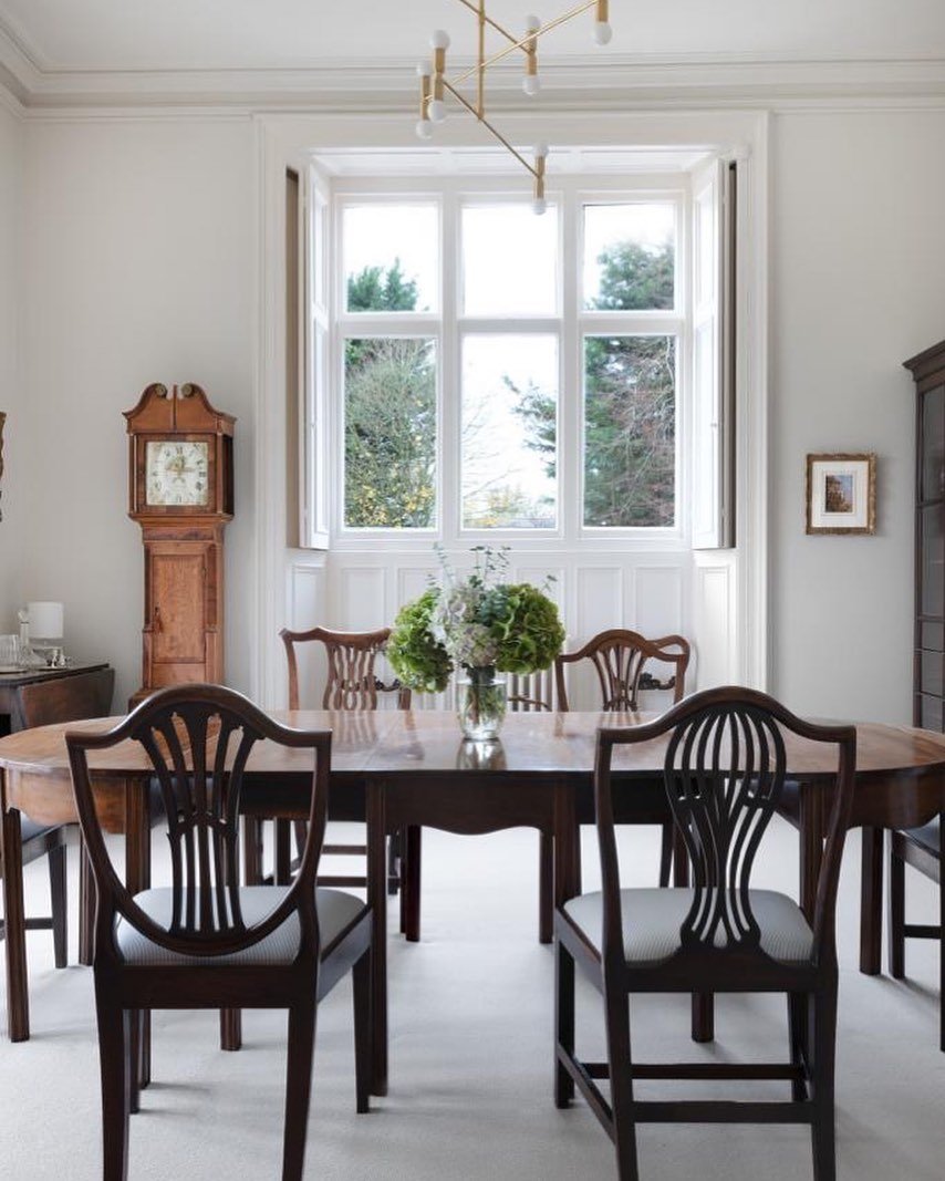
A friend of mine lives near a street where, after the war, the government asked different builders to create their own signature terrace. Same street, same purpose but each builder brought their own style, their own proportions, their own details. Families who’d lost everything could even choose which style of house they wanted.
Think about that.
In a time of rationing and rubble, people were still given choice, dignity, and character. They didn’t throw up identical boxes. They built different house types, different rooflines, different materials. Small flourishes that carried the personality of the builder’s own hand.
Now imagine what that would look like today.
There wouldn’t be choice, there wouldn’t be character, There’d be one approved template and a spreadsheet.
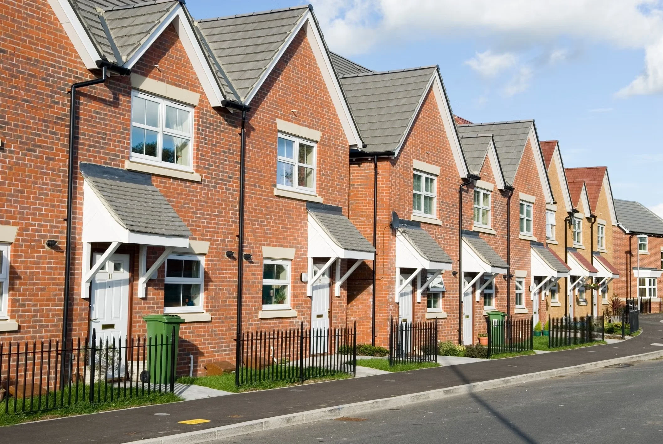
The new-build problem isn’t just aesthetic it’s cultural
Modern housing estates all look the same because they’re designed to offend no one and inspire no one. The brief is minimum cost, maximum units, fastest possible build.
And it shows.
You can feel the cheapness in the proportions. You can see the lack of care in the materials. The houses sit awkwardly in the landscape, like they’ve been dropped there overnight. People call it “simple and modern” but let’s stop lying to ourselves.
It’s mediocrity.
It’s value-engineering to the point where the life has been sucked out of the architecture.
Older generations built slowly. They built for legacy. They built things meant to outlive them.
Now we build things meant to last just long enough to avoid liability.
There isn’t a single new-build estate in the country that will gain listed status in fifty years. But the Barbican? Trellick Tower? Brutalism in all its divisive, concrete glory? Those buildings will be protected and celebrated long after today’s estates have been demolished and rebuilt for the third time.
Even the post-war era, often described as bleak, had more integrity.
The flats were generous, the houses were sturdy and built to last.
The ambitions were civic and there was a sense of responsibility to the people who would live there.
Can you say the same today?
And let’s be honest, good design has become a luxury
Here’s another layer no one really talks about.
Good design has quietly become something only the wealthy have access to.
Not because they care more but because they can afford architects, consultants, designers, planners. And even then, money doesn’t guarantee taste. You only have to drive around Cheshire to see that wealth isn’t the same thing as good design. Some of the biggest houses are also the worst offenders: oversized, mismatched, out of proportion, built to impress rather than endure.
But that’s the point, design shouldn’t be the preserve of people with big budgets.
It should be for everyone.
A well-designed home shouldn’t be a privilege. It should be a baseline.
Everyone deserves a home with light that feels good, rooms that make sense, materials that don’t fall apart in five years, spaces that help you breathe rather than drain you.
Good design isn’t about luxury. It’s about dignity.
It’s about being thoughtful about how people live, how they move, how they rest, how they raise their kids, how they age. It’s about giving people spaces that support their lives instead of fighting against them.
We used to treat that as a civic responsibility. Now it’s treated like an upgrade package.
That’s the real loss.
When mediocre design becomes the norm, people start believing they should be grateful for anything that stands upright. When good design becomes a luxury product, the majority get left living with spaces that chip away at their quality of life.
Everyone should have access to homes that feel good not just the handful who can pay for it.
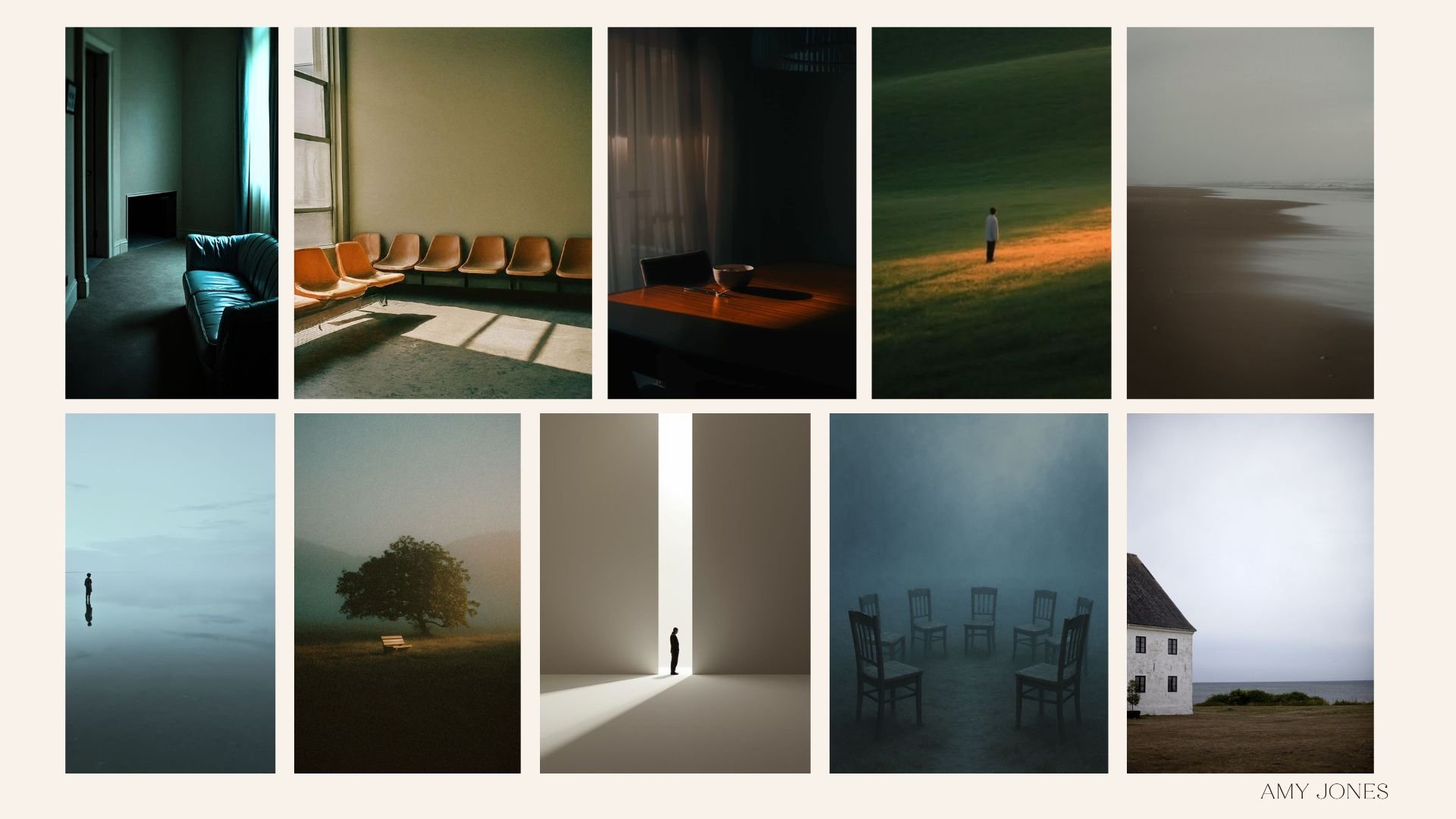
People are desperate to put character back in
You can see the backlash in people’s behaviour.
The rise of panelling, the hunger for mouldings, the endless attempts to make a blank new-build feel like it has a story.
It’s not a trend, It’s a symptom.
People aren’t obsessed with period features because they want to live in a museum.
They’re obsessed because period homes were built by people who cared about proportion, detail, atmosphere, and identity. People are trying to create the character the developers didn’t bother to give them. That’s why period homes never stop selling.
That’s why even run-down Victorian terraces have more charm than a brand-new box.
That’s why people queue to buy houses with quirks and flaws.
We’re not craving “minimalism.” We’re craving meaning.
It’s not just homes, it’s everything
Sitting on the train today, even the bridges told the same story.
They used to be feats of engineering. Arches you could stand under and feel something. Structures built by people who would never live to see how admired their work became.
Now they look like temporary scaffolding. Flat, generic, functional. The bare minimum that can be signed off.
If Isambard Brunel saw half of them, he’d turn in his grave.
And it’s the same with schools, libraries, pavements, public squares.
Everything is designed to the minimum viable standard, nothing goes beyond function, nothing tries.
We’ve traded craft for convenience, pride for profit.
And the result is a country that feels emotionally grey.
Bad design isn’t harmless, it’s demoralising
We underestimate how much our surroundings shape us.
When everything around you says “that’ll do,” it does something to your spirit.
You feel it in your body and you absorb it without realising. Bad design makes people smaller. Good design lifts them.
You can see the difference in how people behave in beautiful cities.
They walk differently, they look up, they soften.
Our built environment affects our self-esteem, our ambition, our hope.
It tells us what’s possible and right now, the message is bleak: keep costs down, keep things bland.
But here’s the shift that’s already happening
People are starting to rebel against sameness.
You can feel it in interiors, in fashion, in culture. A quiet revolt against the beige, the cheap, the temporary.
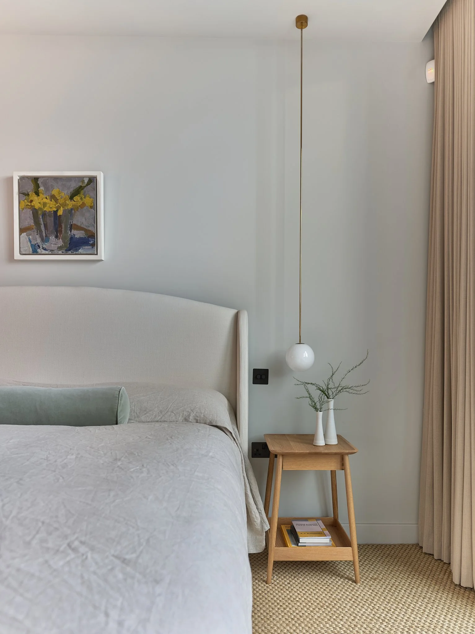
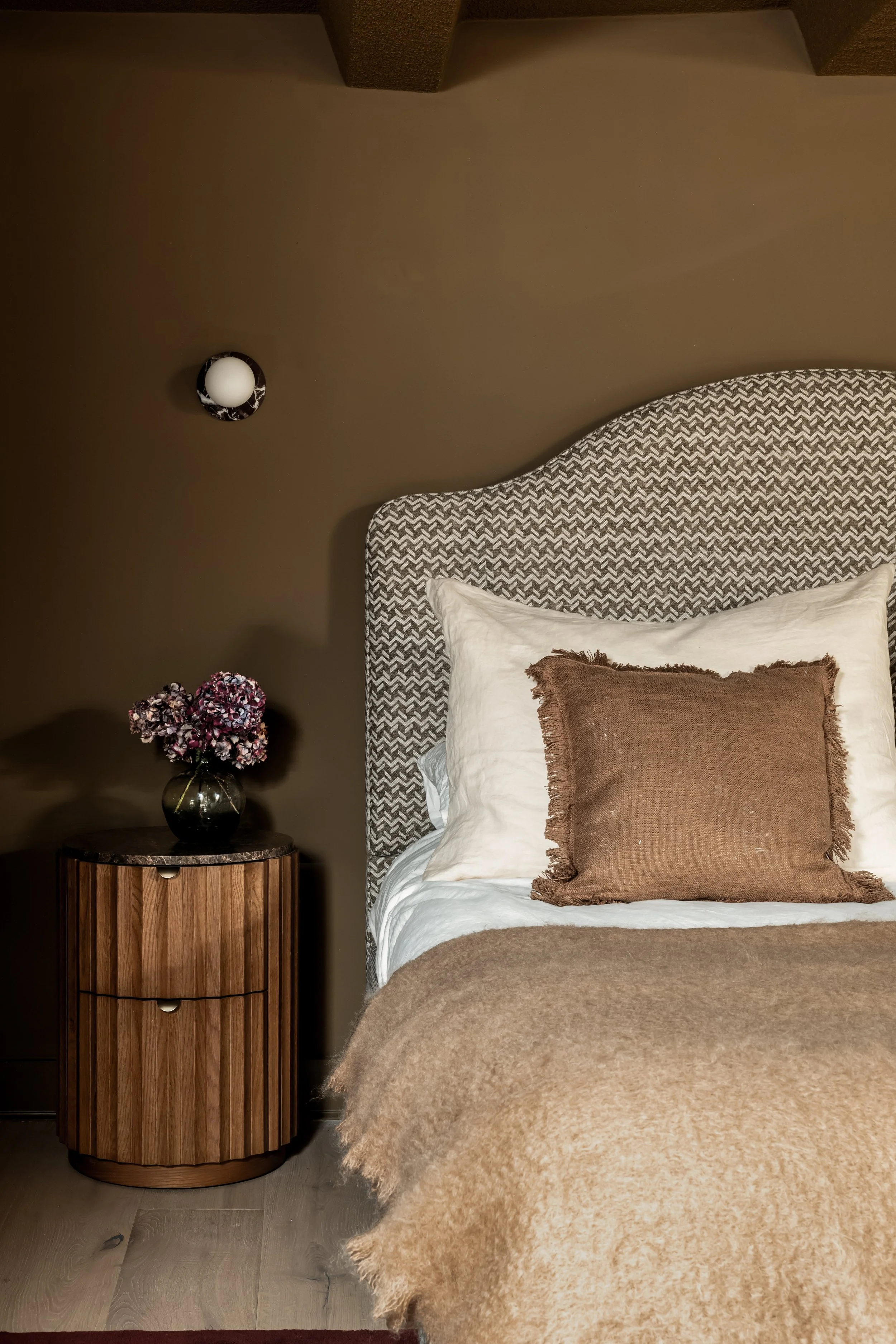
People want depth, texture. They want warmth. They want homes that feel like somebody actually thought about them.
And that’s the real reason my work lands.
I’,m not decorating, I’m restoring what has been lost.
I’m putting soul back where the industry has stripped it out. I’m creating homes that remind people of something older and deeper, that a place can hold you, change you, soften you, support you.
You’re building the emotional architecture that modern development forgot.
Because the truth is simple: we get the world we’re willing to tolerate.
If we accept cheap, we’ll be given cheap. If we accept soulless, we’ll be surrounded by soulless. If we accept “that’ll do,” that’s exactly what we’ll keep getting.
But the moment we stop settling, everything shifts.
Good design isn’t a luxury, It isn’t a privilege, It isn’t something reserved for postcodes with money.
It’s a standard, a foundation, a basic human right to live in spaces that don’t drain you.
And I’m done watching mediocrity be treated as normal, I’m done pretending this is the best we can do. I’m done acting like character, care, and beauty are relics of the past.
We can build better. We can demand better. We can live better.
And the people who are raising the standard, the ones bringing back depth and intention they’re not just designing spaces, they’re shaping a new way of living, a new expectation, a new era where our built world finally reflects our worth.
And that’s exactly where I intend to stand.