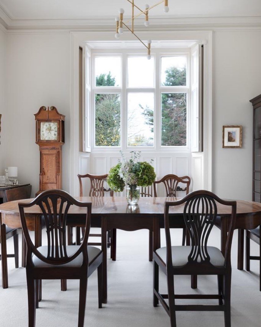
Navy and Burnt orange always makes for a bold colour scheme. They are complimentary colours and sit opposite each other on the colour wheel and as such lend themselves to dramatic scheme. A complementary scheme such as this is believed to provide the ideal balance in a room as it includes both a warm and cool hue. Although it would be a great starting point to any interior scheme these colours lend themselves very well to a mid century style scheme.
Saberio Interview
The Lovely people over at Saberio picked my brains regarding all things Interiors over on their blog. if you would like to check it out follow the link below.


Max Brown Hotel, KuDam, Berlin
I had the privilege of visiting this hotel on a regular basis when I lived in Berlin, it appealed to me because of the relaxed retro vibe, from the mid century furniture against the exposed ducting and copper pipes all set against the tropical wallpaper.
Its a bold look and the use of the mustard colour throughout, the ‘red thread’ that helps link the spaces, helps create cohesion and brings all the elements of the scheme together.
Its a great example of using vintage pieces in a modern setting without it looking stuffy and contrived.
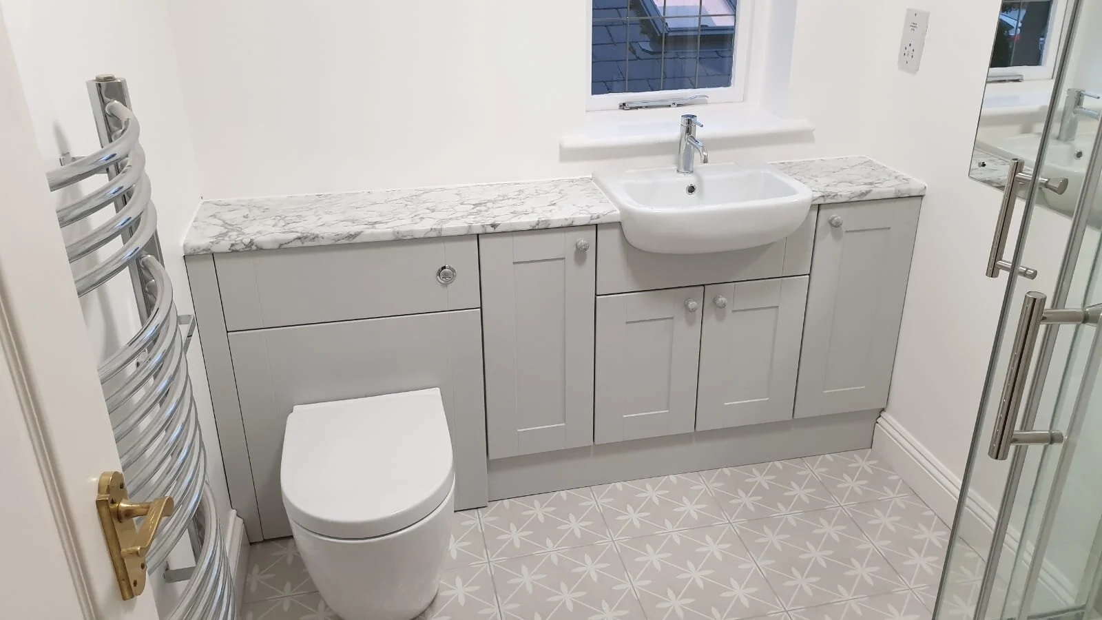
Rental Bathroom Makeover, Cheshire.
Back in April 2019 I was tasked by the owners of a rental property in Cheshire to help them update the bathroom of their rental property. They felt that it was looking a bit tired and dull plus there were leaks around the shower from a previous bodge job. As it was a rental property we were on quite a strict budget but it had to be of a good quality in order to appeal to the required tenant.


The client wanted something fresh, practical and with lots of storage and we also believed that a relatively neutral scheme would have the broadest appeal.
To provide plenty of storage we opted to go down the route of fitted units so that all clutter could be hidden. These particular units were from a company called Calypso who I had used many times before and decided on the Chiltern range with its traditional shaker design in the Dusk grey finished off with a marble effect worktop. To create interest in the room we opted to go for patterned floor tiles from Laura Ashley called Wicker in the Dove Beige colour.
I’ll think you will agree the finished room is far brighter, cleaner and fresher looking than before and most importantly the clients were pleased with the finished result!


If you live in the Cheshire area and would like help with your rental property and achieving the best ROI then get in touch to see how I can help.


Daily Telegraph Homebuilding and Renovating Awards 2019
Ah so here it is we are officially in the Homebuilding and Renovating Magazine as the Readers Choice Winner.
We are still so excited to see this project that we worked so hard on featured and being recognised and to read some of the comments from the judges it was also great to see our landing appear in another feature in the magazine, even the cat approved!
The full article featuring more pictures of the house is due out this year and i will be excited to share even more with you all.