There’s a difference between colour that decorates and colour that grounds. I only work with the ones you can feel.
Lately, I’ve been thinking about what gives a room its presence.Not what makes it beautiful, that’s too easy, but what makes it stay with you.
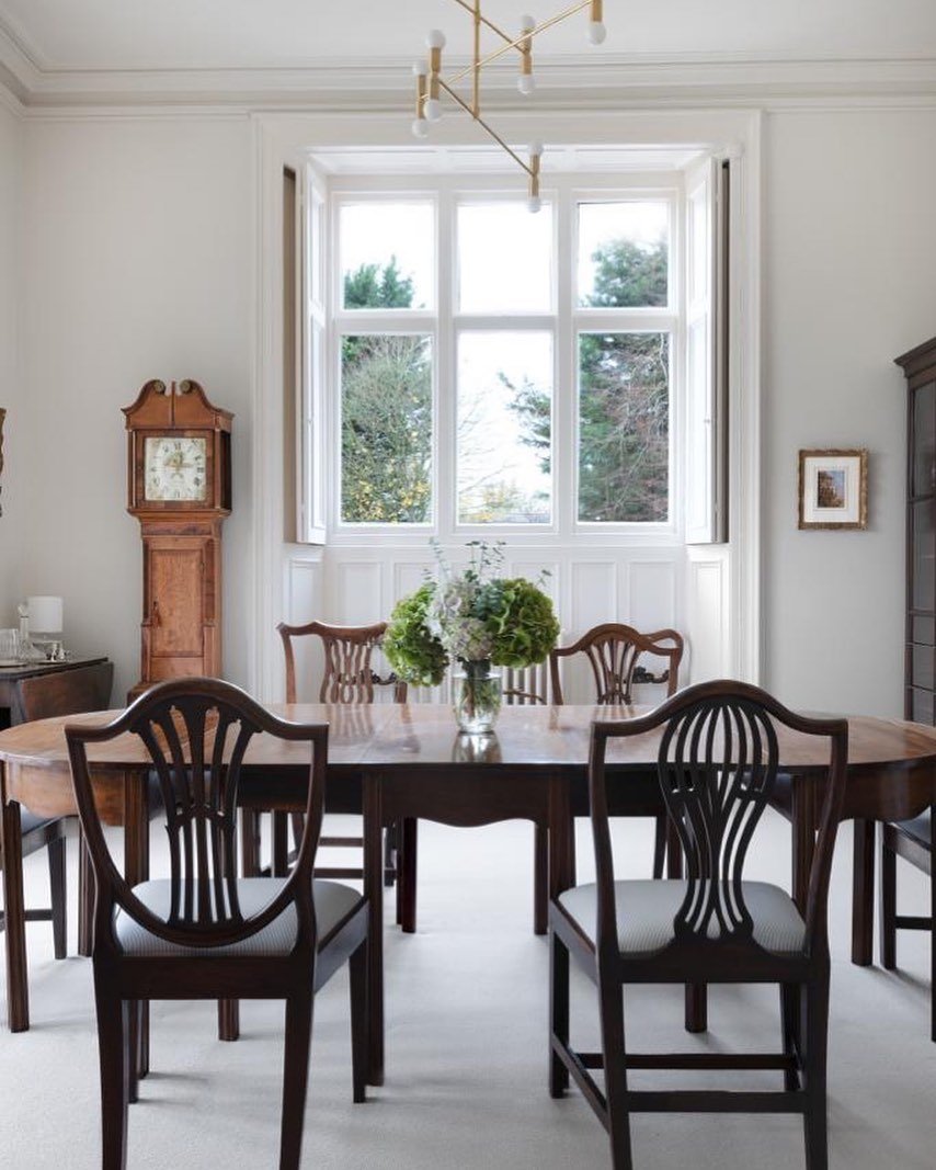
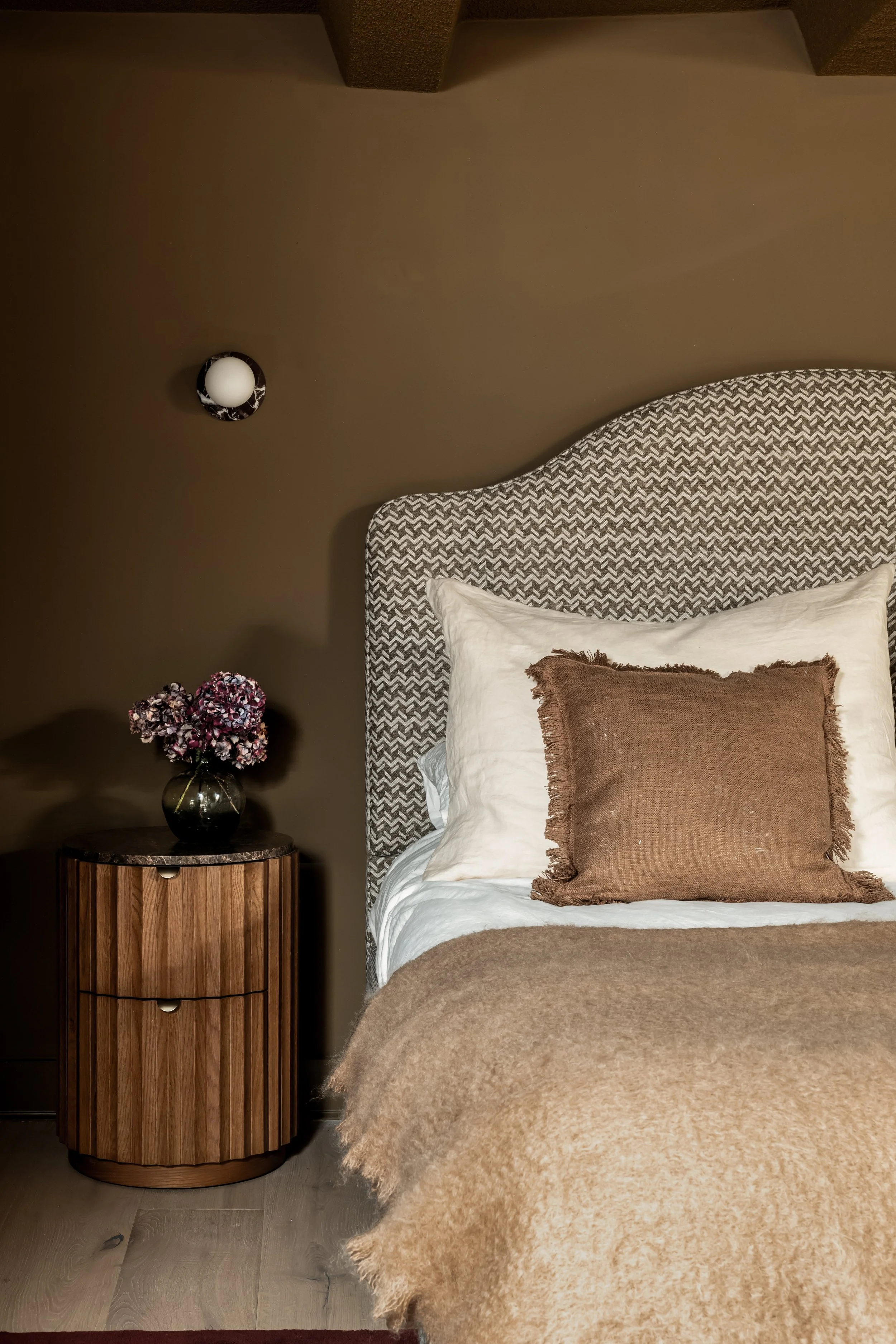
People often think choosing colour is about what looks good together, but that’s never how I’ve worked. I don’t want colours that match, i want colours that mean something.
My palette has to have weight, it has to feel lived-in, human, and a little imperfect.
I’m not drawn to flat tones or polite neutrals that hover on the surface.
I want and i need depth. Im inspired by the way soil darkens after rain, the warmth of candlelight against plaster, the quiet confidence of linen that’s been softened by time.
Colour, for me, isn’t decoration, it’s distilled emotion. It’s how a room holds you before you’ve even realised why. That’s why my spaces feel the way they do:
calm, grounded, cinematic, they don’t perform, they just are.
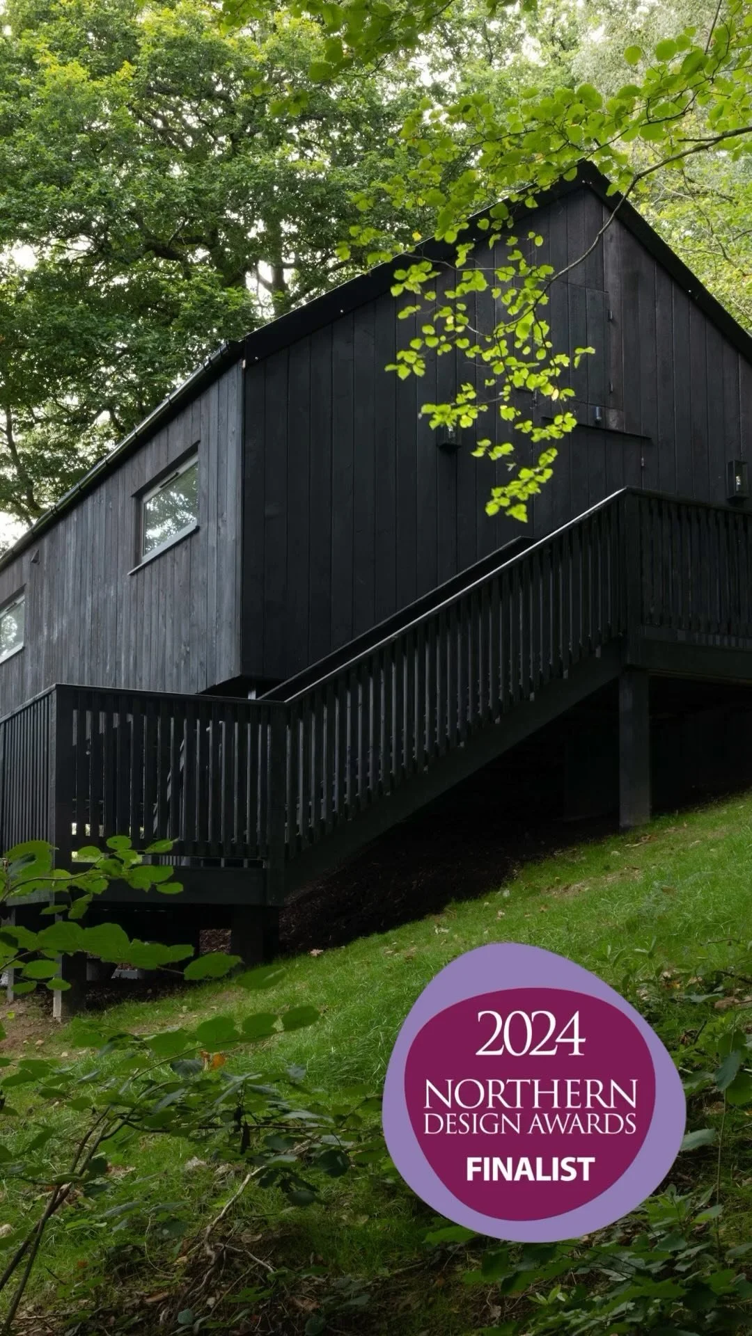
Winning the award recently reminded me the details that seem quiet to others are the ones that define my work. Unseen doesn’t mean unfelt, and that applies to colour, too.