Project reveal -Northwich, Cheshire Extension

We were contacted by our client in Northwich, Cheshire back in January 2019 as they wanted help with designing their open plan Kitchen/dining/snug extension, hallway and playroom. They wanted me to assist with the design and sourcing of the areas as well as the general presentation of the space. I was approached as they wanted to achieve a warm, textured space that had authentic materials whilst also being family friendly.

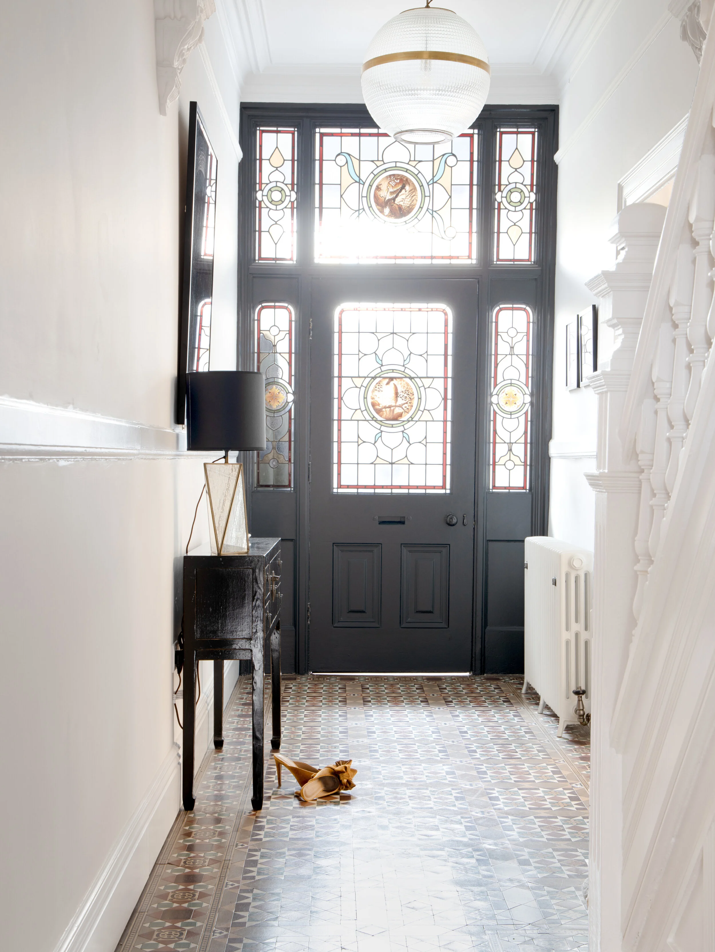
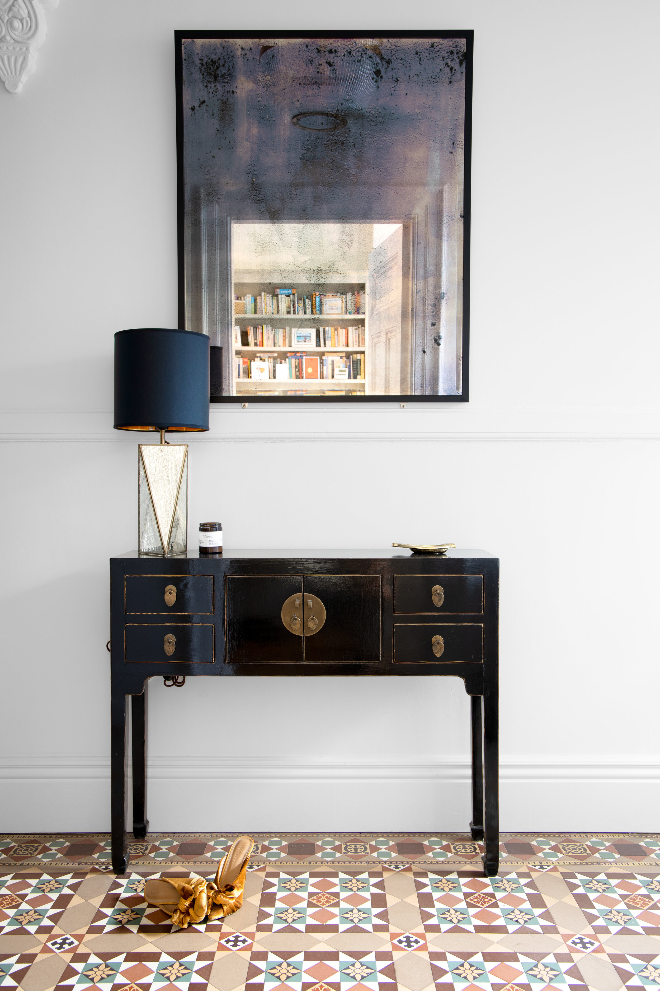
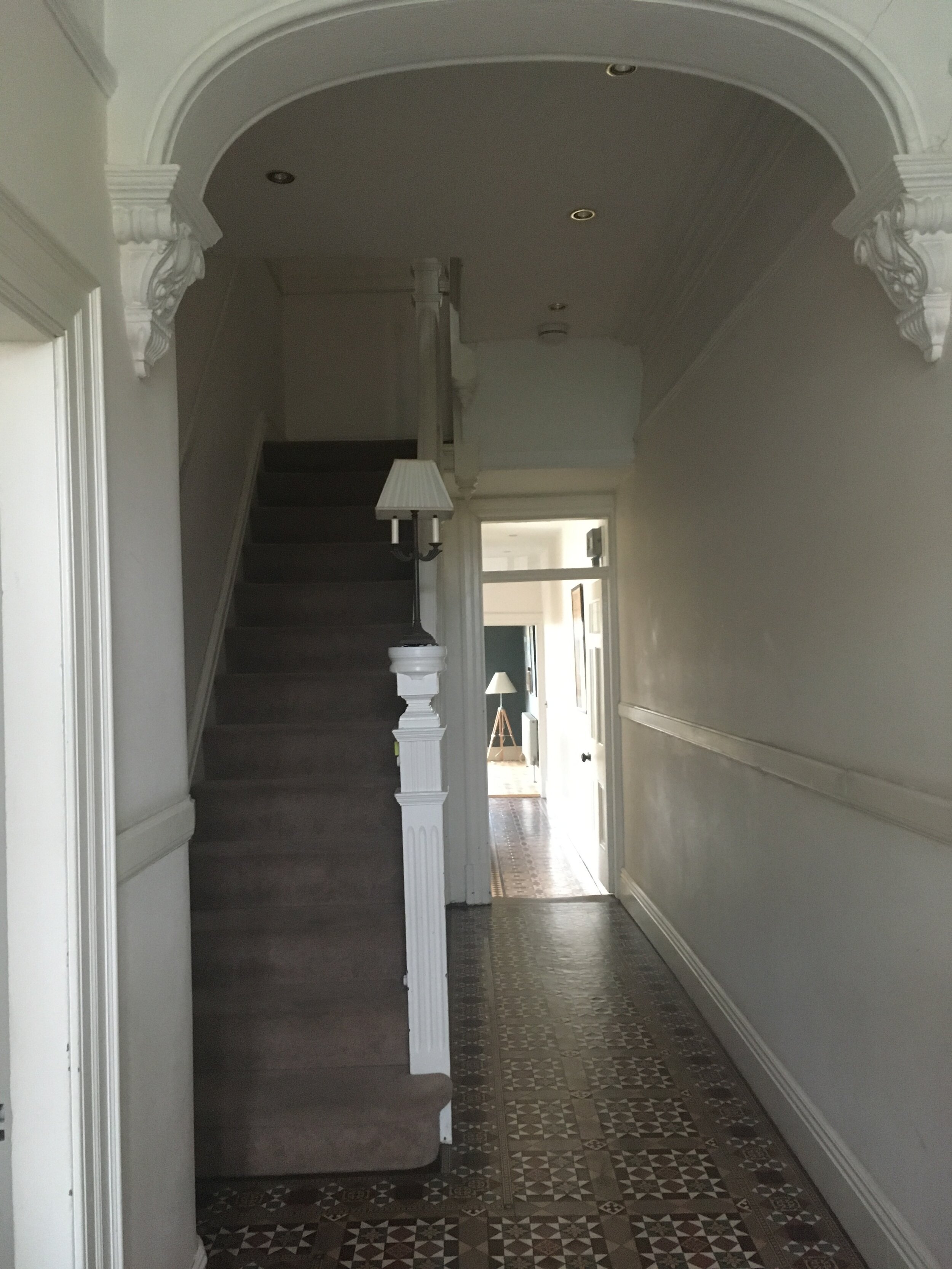
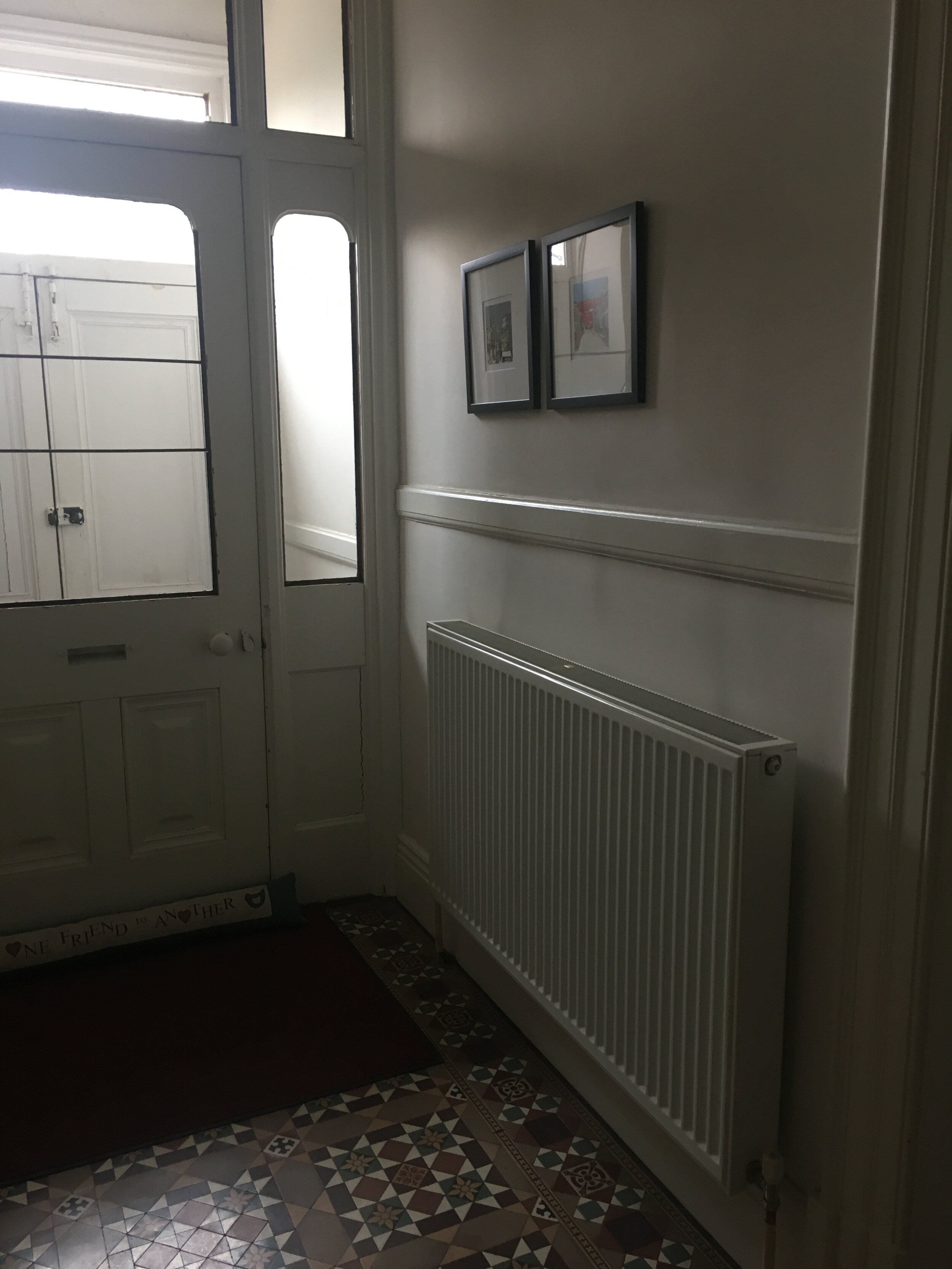
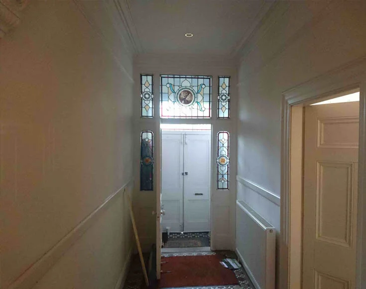
The owners lived in a Victorian semi-detached house which featured all the usual period detailing of that decade including these lovely Minton tiles in the hallway that they were keen to make a feature of. The front door also had beautiful stained glass panels, which are removed in the below photo, and they wanted to enhance this space and make it a pleasure to walk into to and for it to set the tone for the rest of the house.

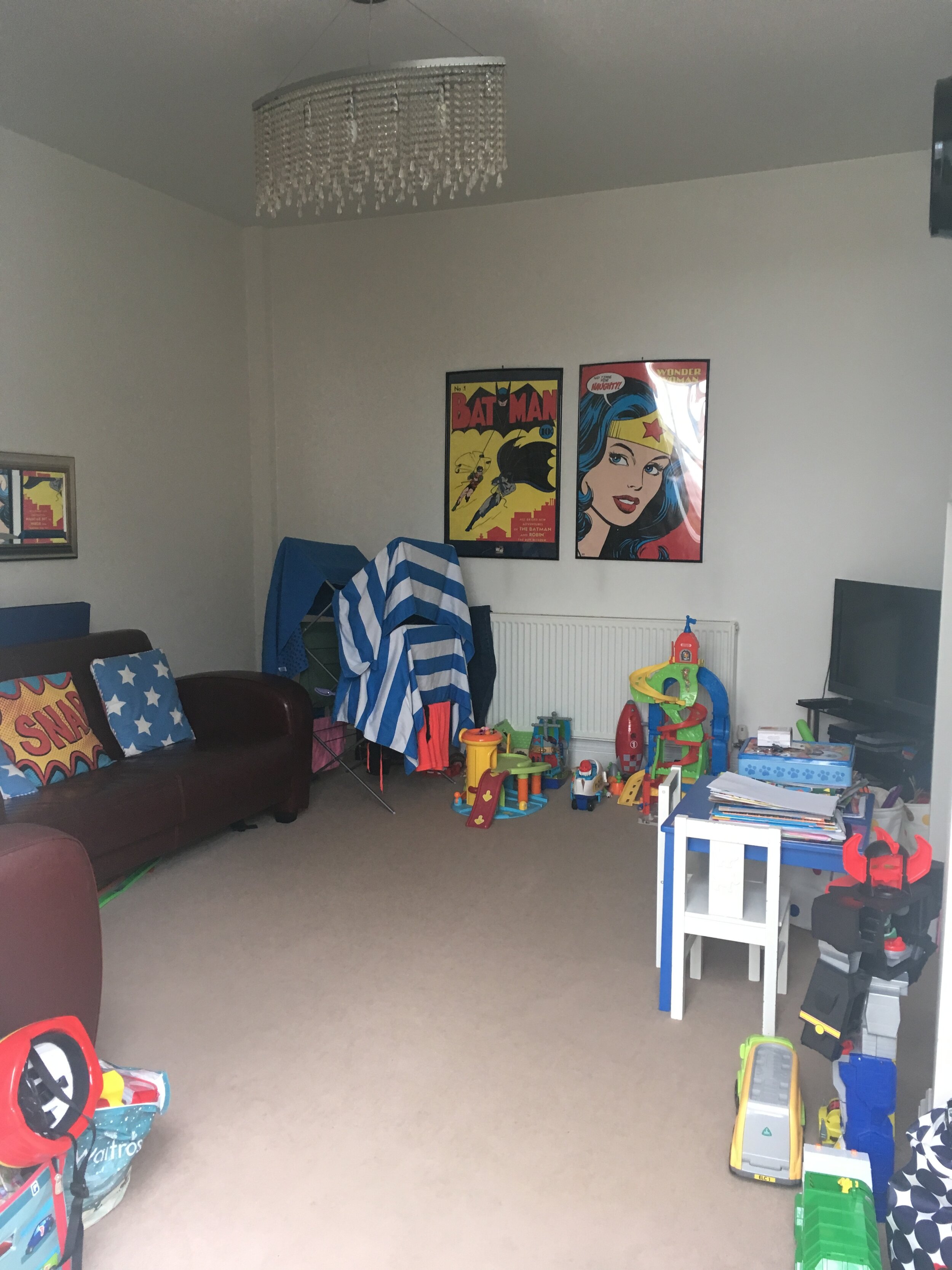
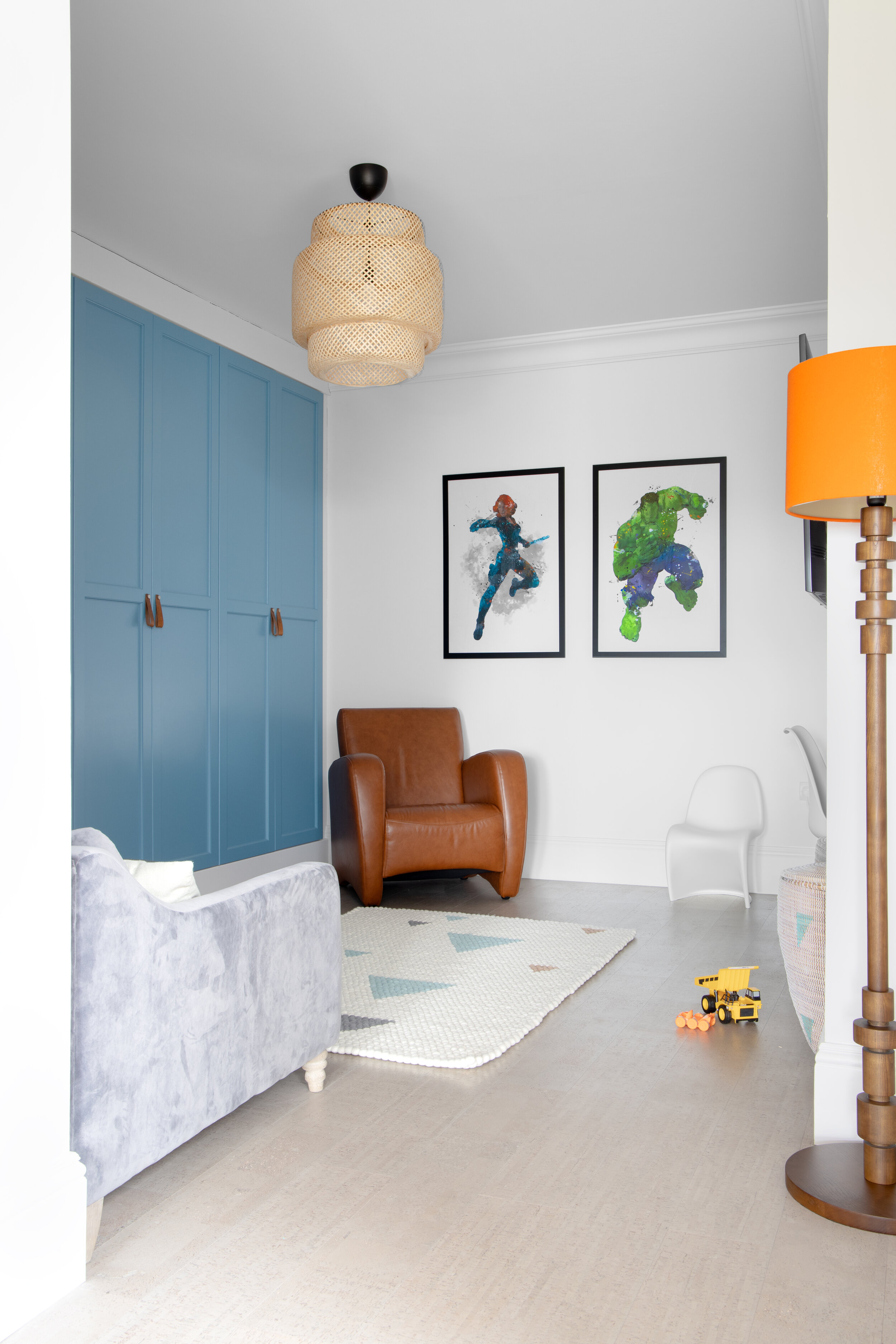
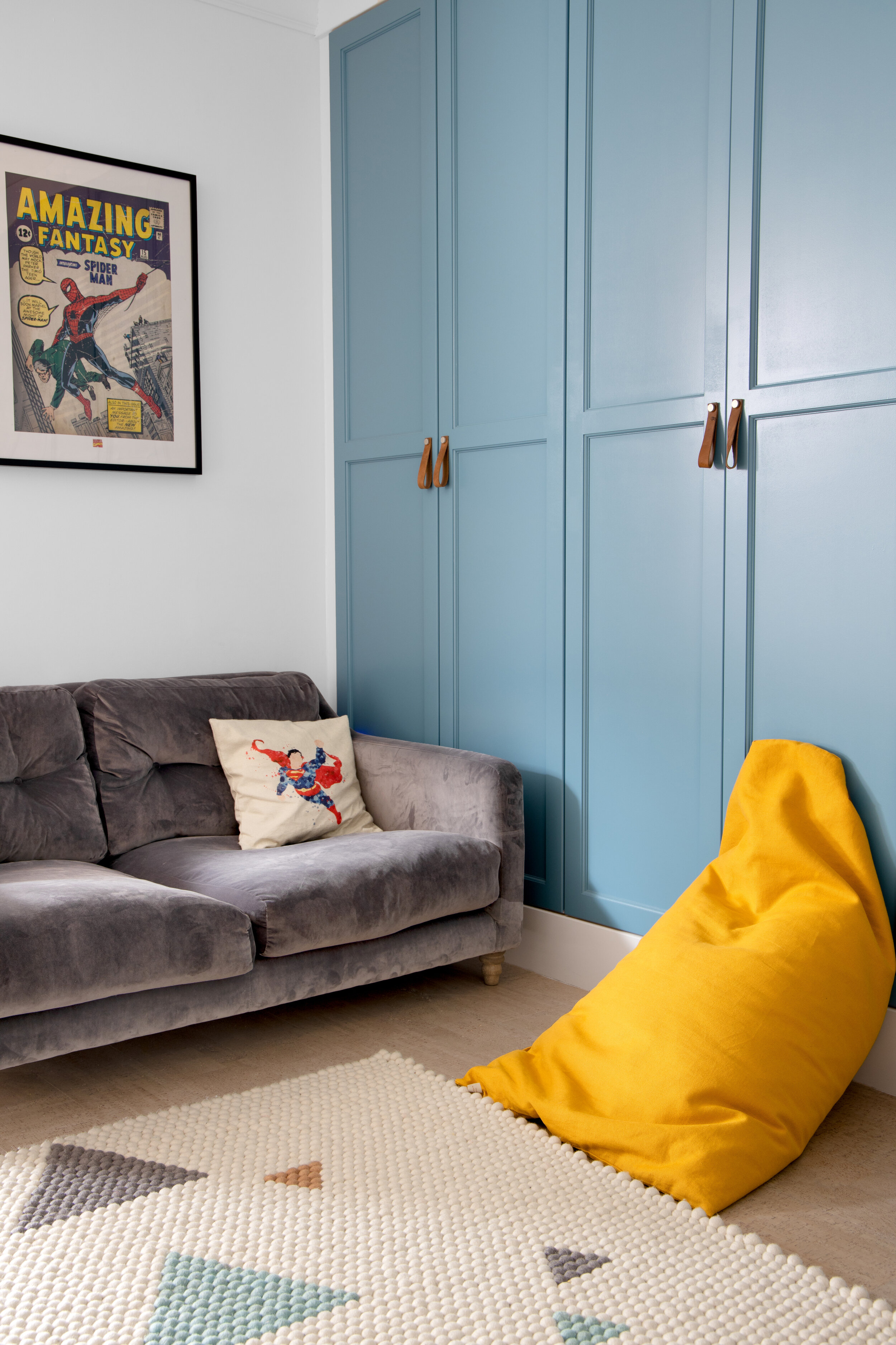
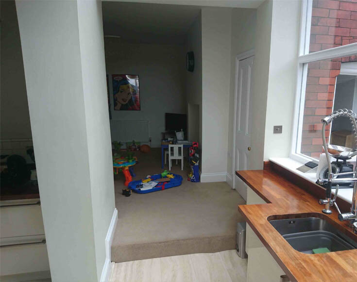
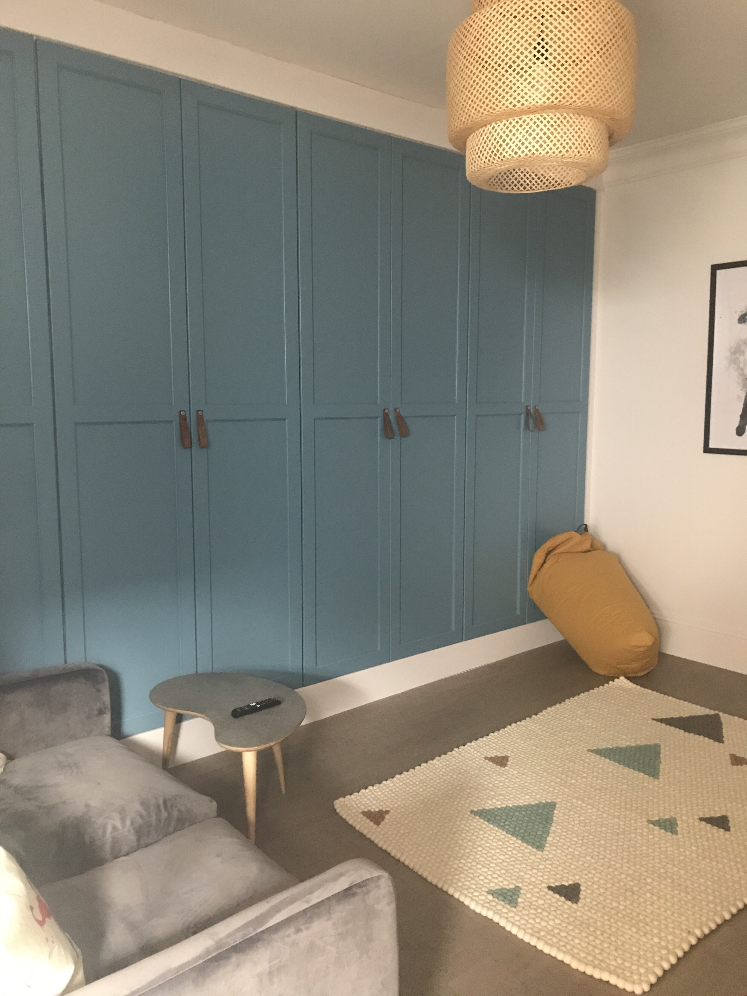
The owners have 3 young boys and wanted help redesigning the playroom that not only worked for them now but grew with them when inevitably toys are replaced with consoles. They wanted additional storage so as to which could be used to hide away all the kids toys when not in use and to have something on the floor that was hard wearing and would keep up with the demands of active young boys.

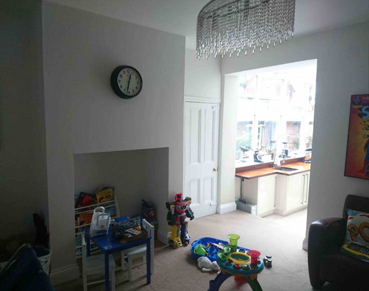
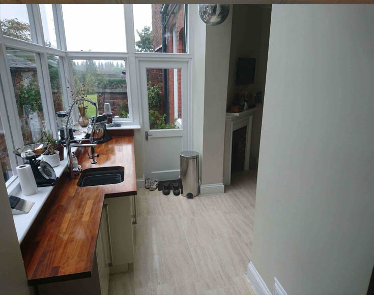
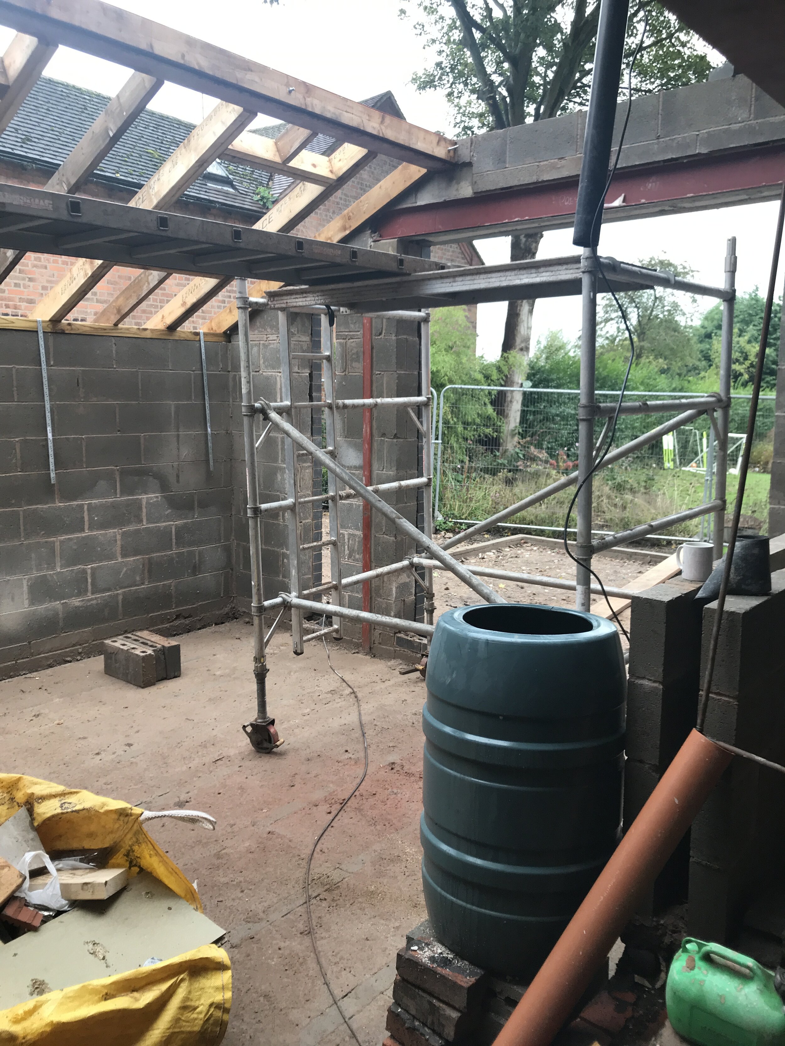
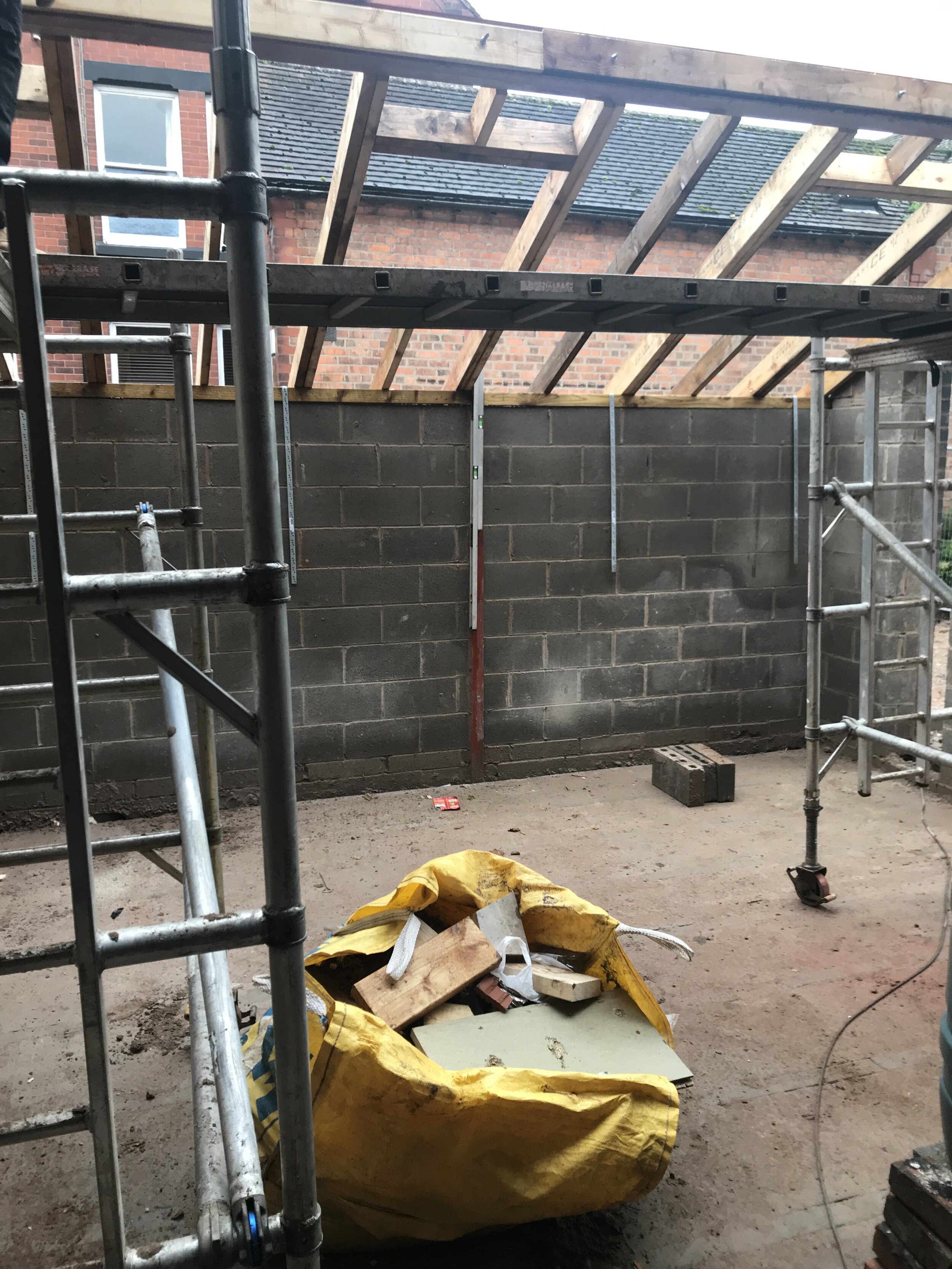
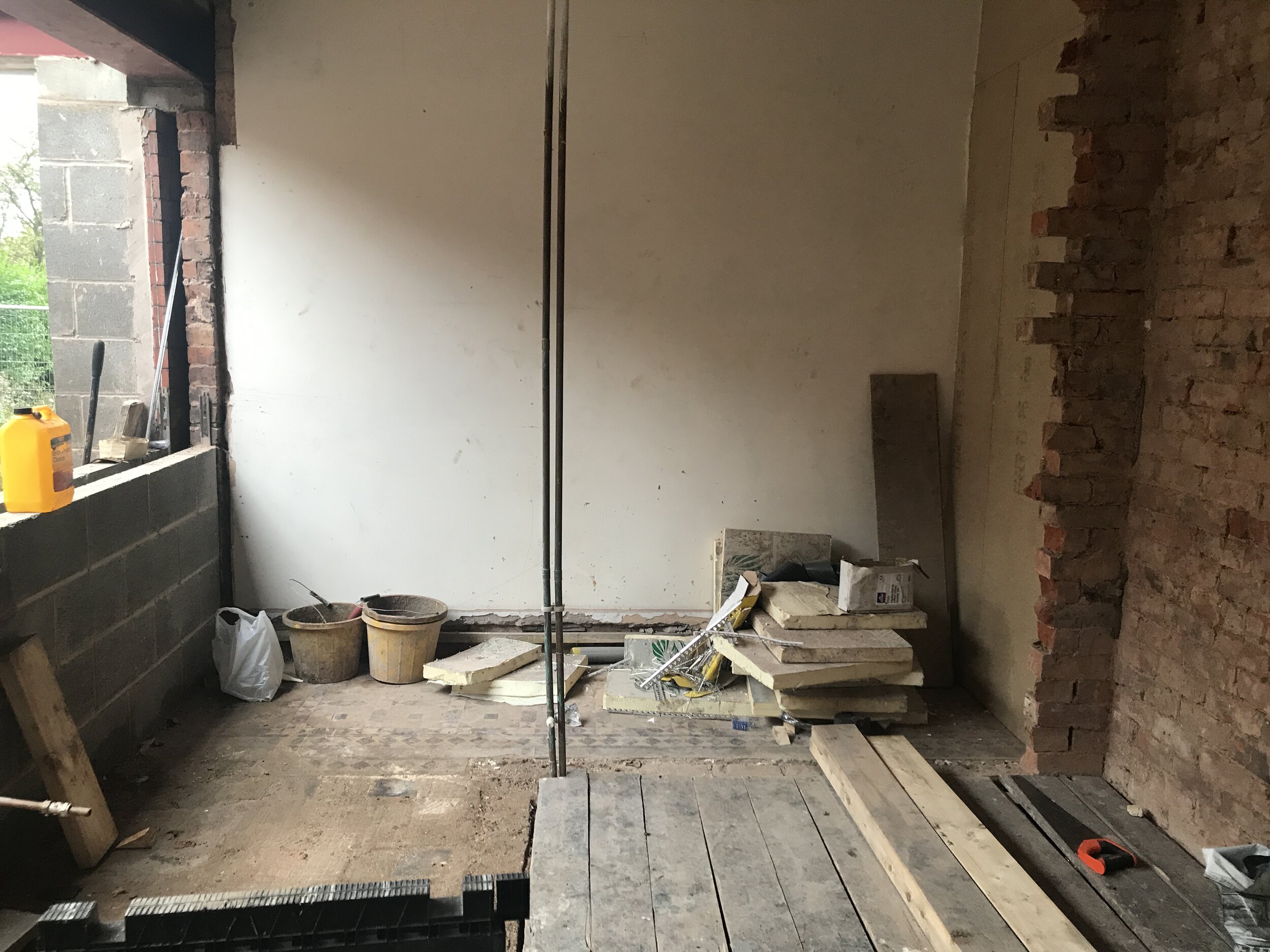
Below are some images of the space prior to any work being carried out. The clients were keen to have lots of light flooding this new extension and to also have good views out into the garden.

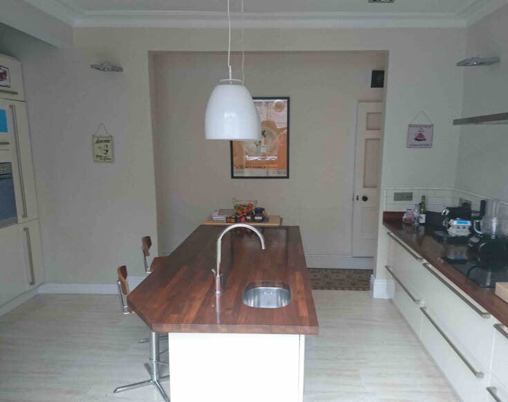
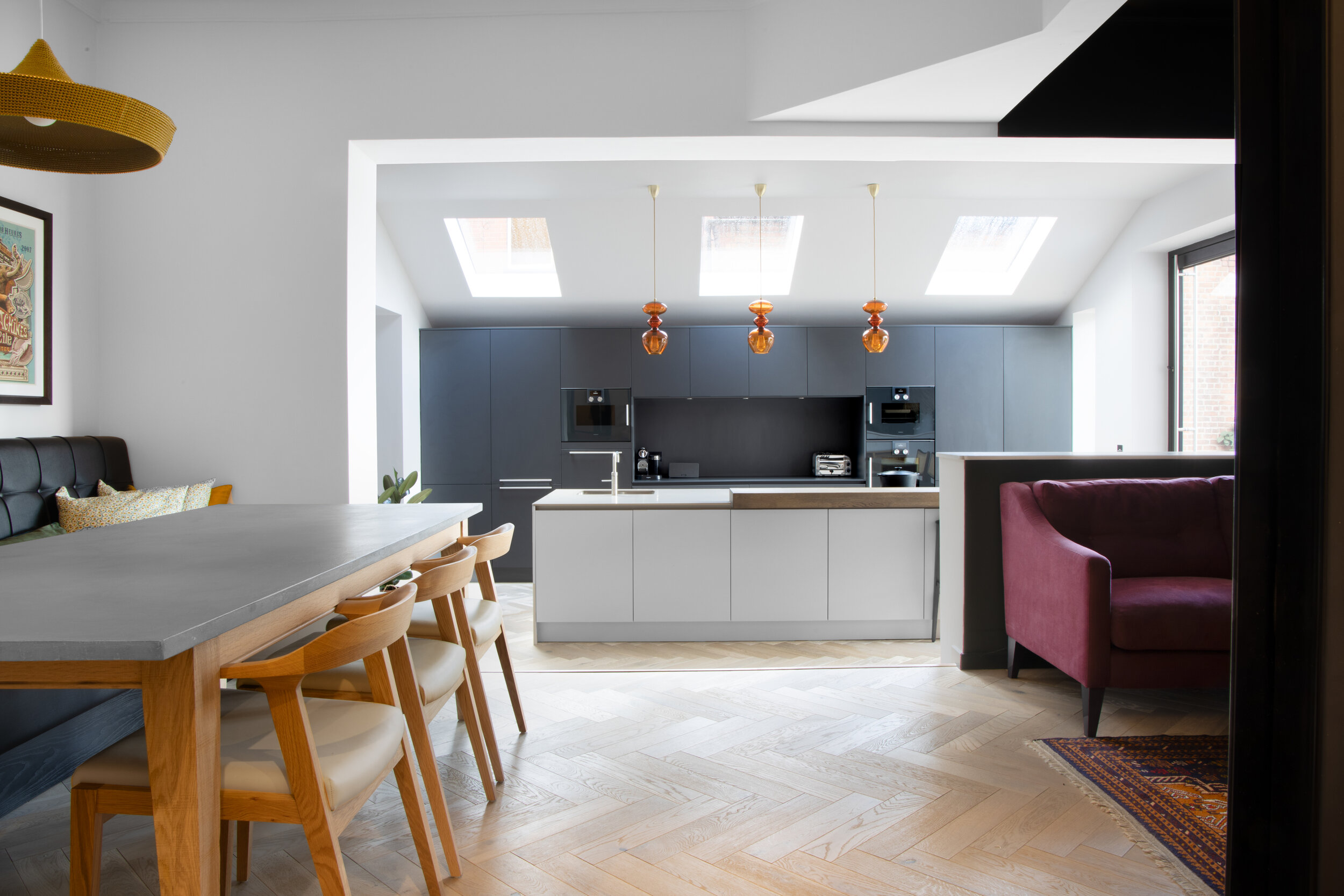
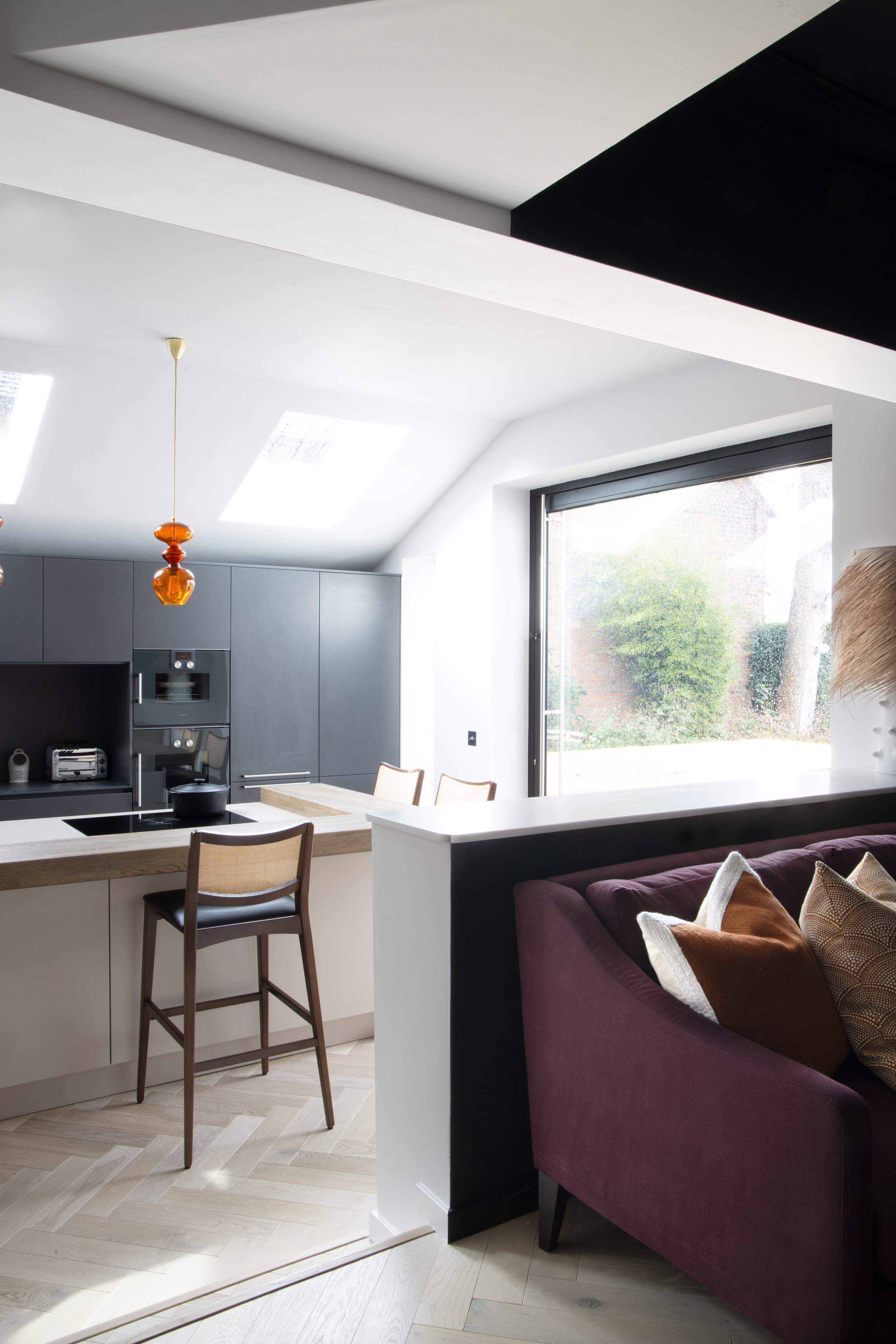
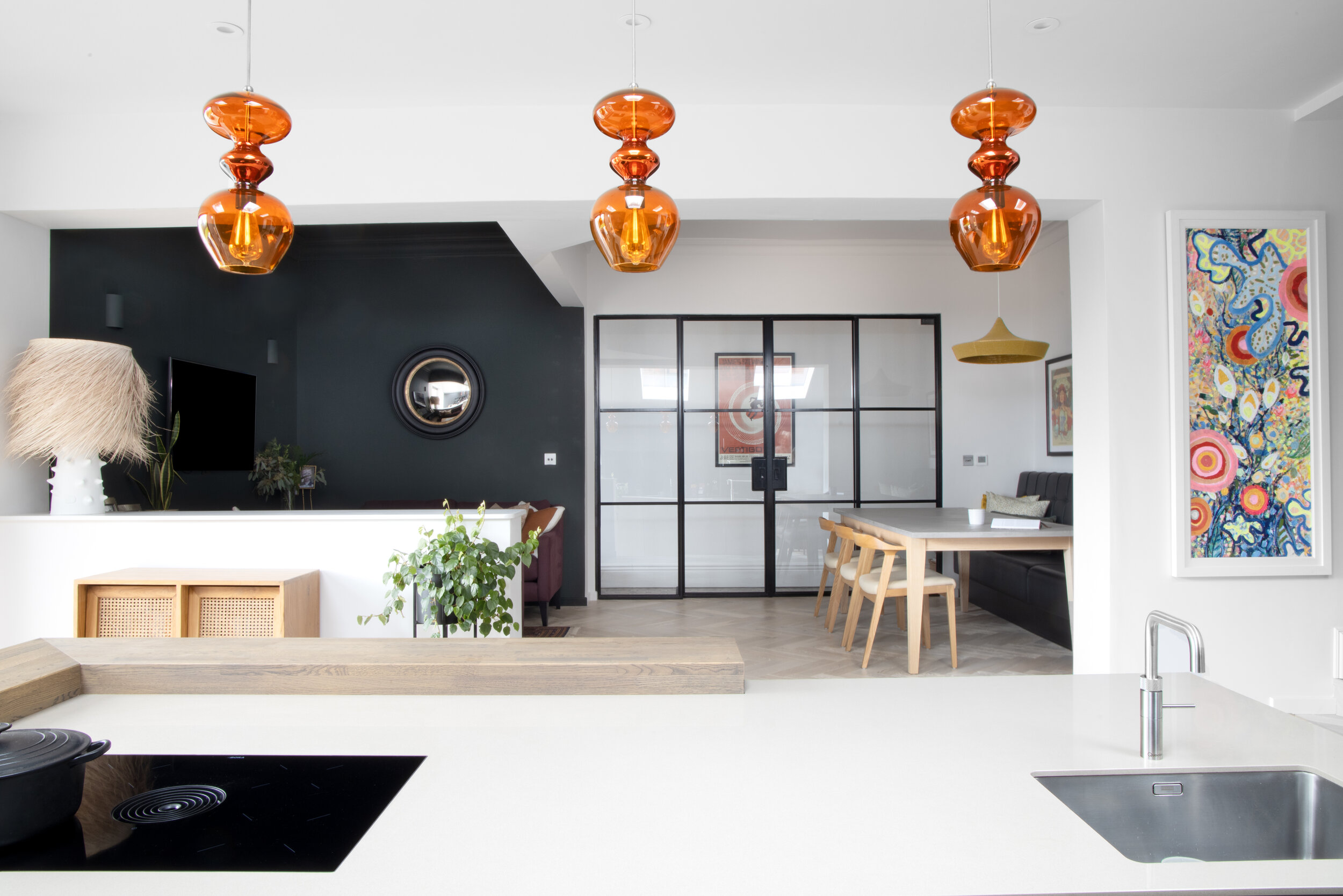
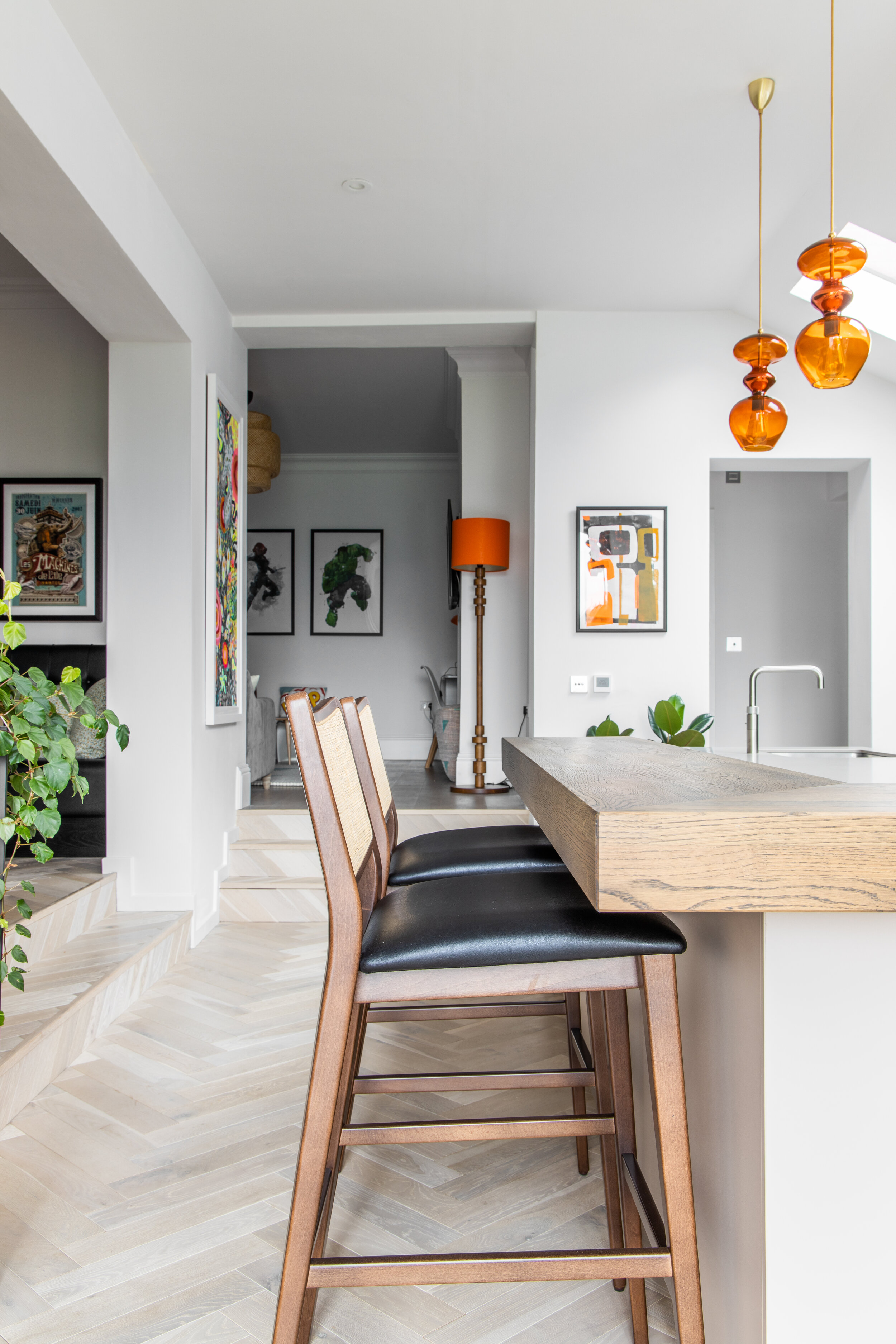
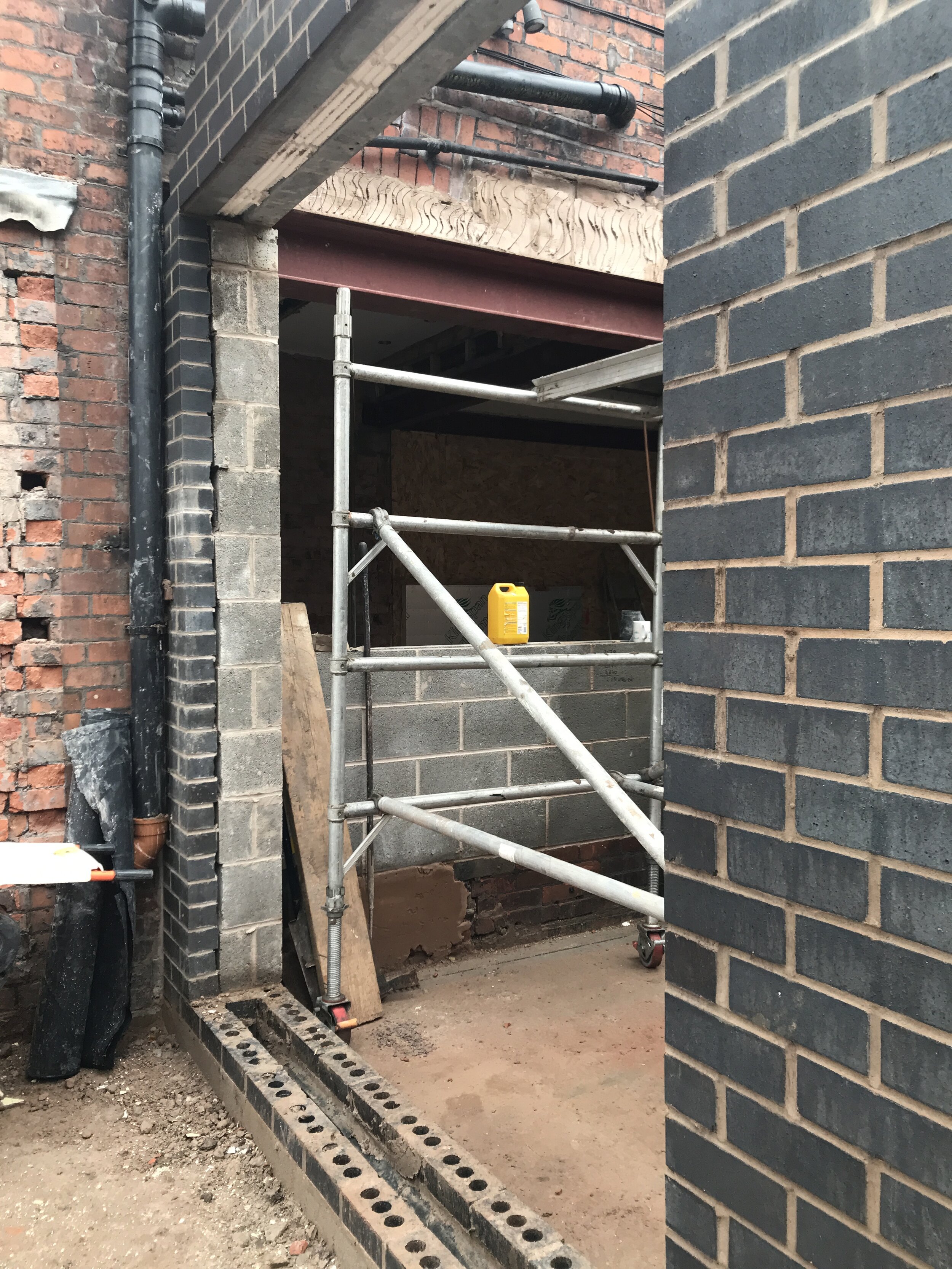
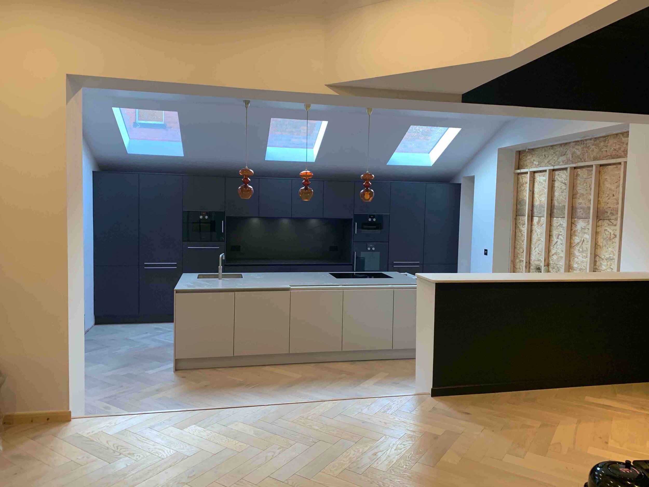
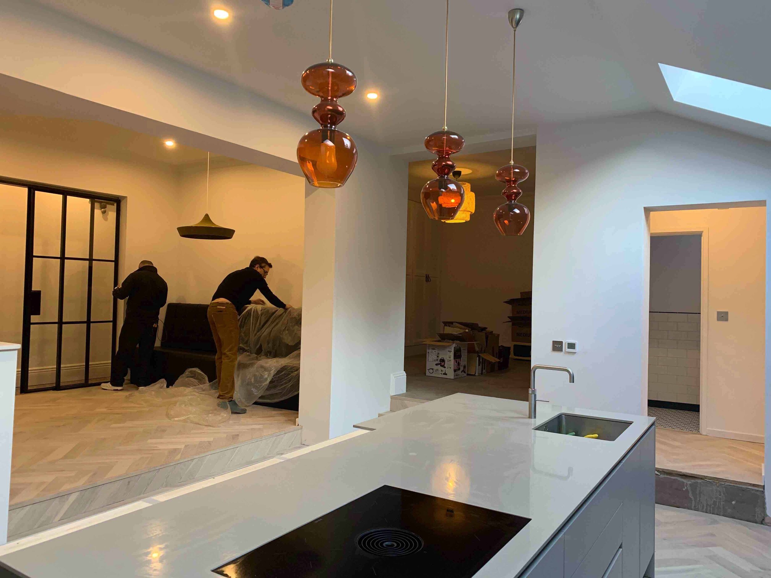
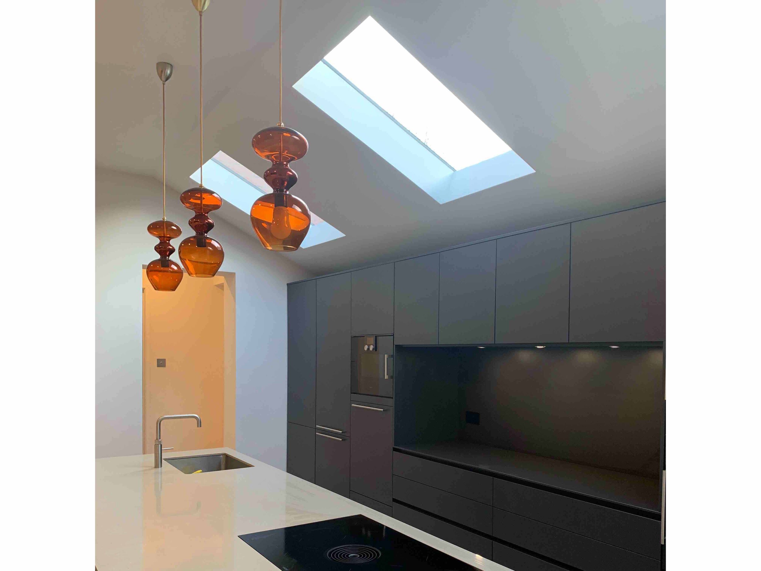
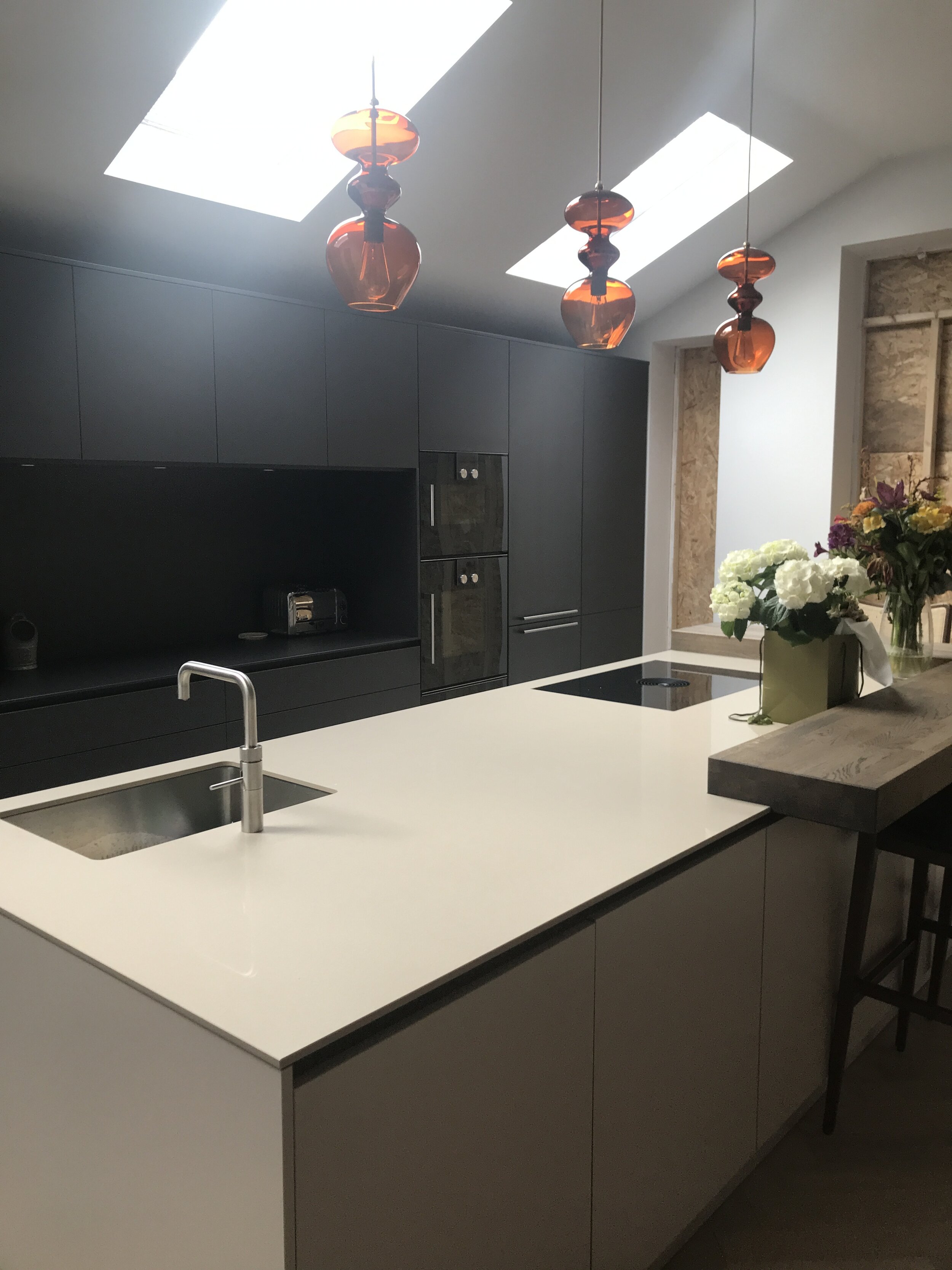
Below are a couple of images during the fit and you can see how open the space is and how we needed to come up with a scheme that brought all these different areas within one space together. One colour that runs throughout the open plan space is a burnt orange. We used it on the lights above the Island from Holloways of Ludlow and as an accent colour in the other spaces, this helps link the

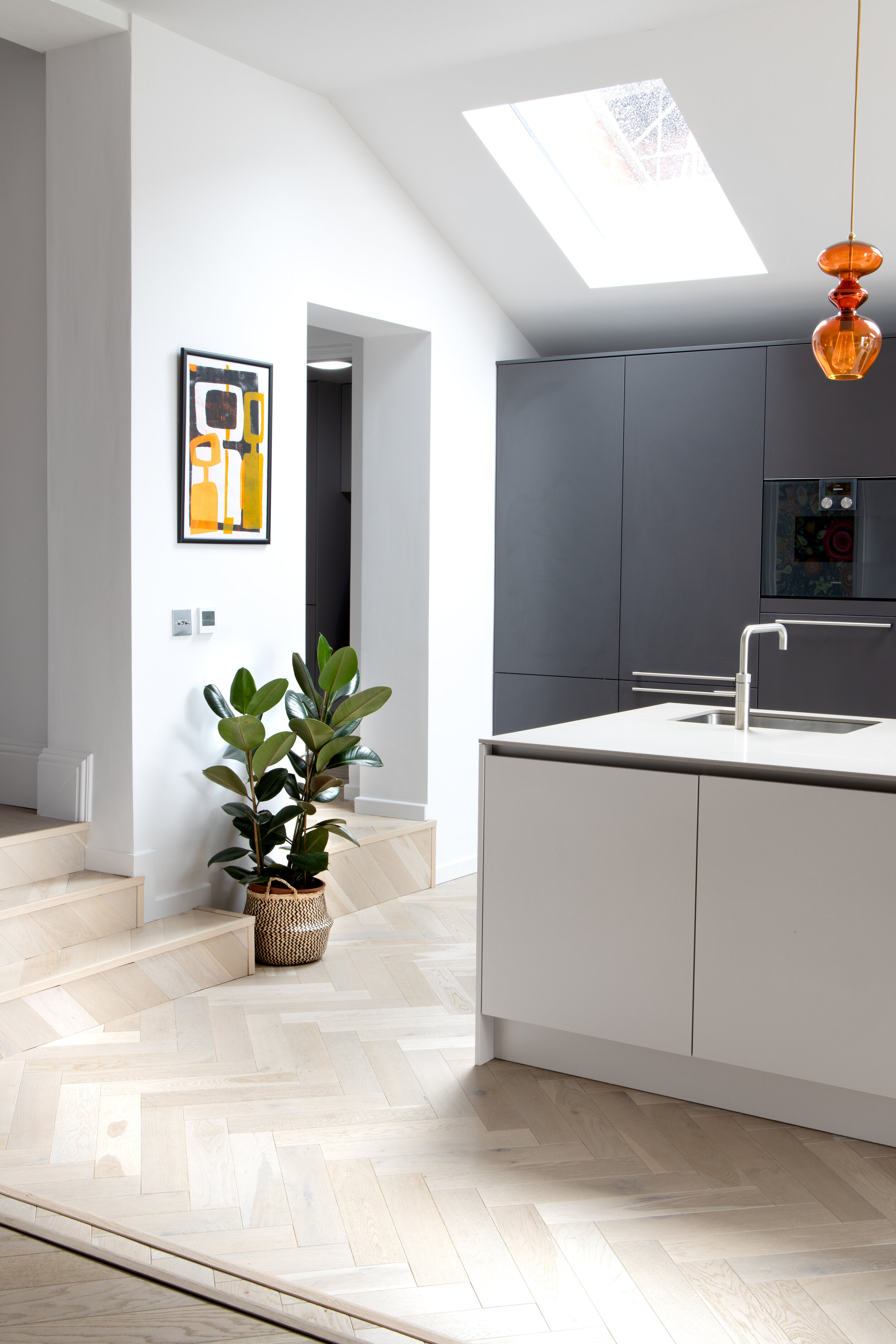
Velux lighting was added into the in the ceiling to bring some light into the space along with a 3mx3m pivot door from the kitchen leading out onto the patio.

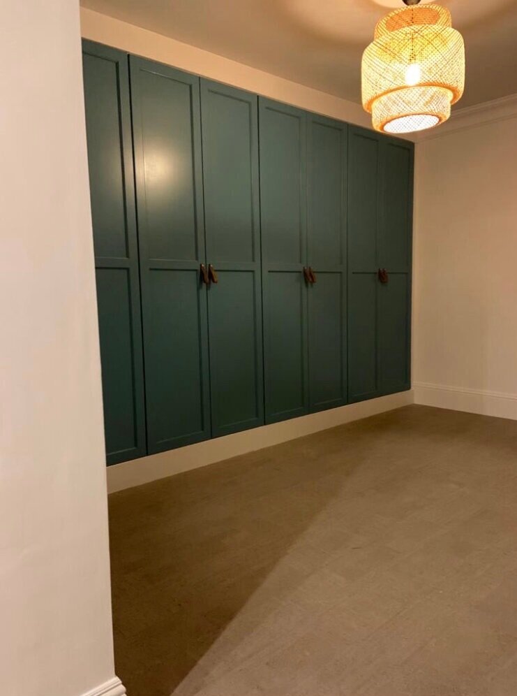
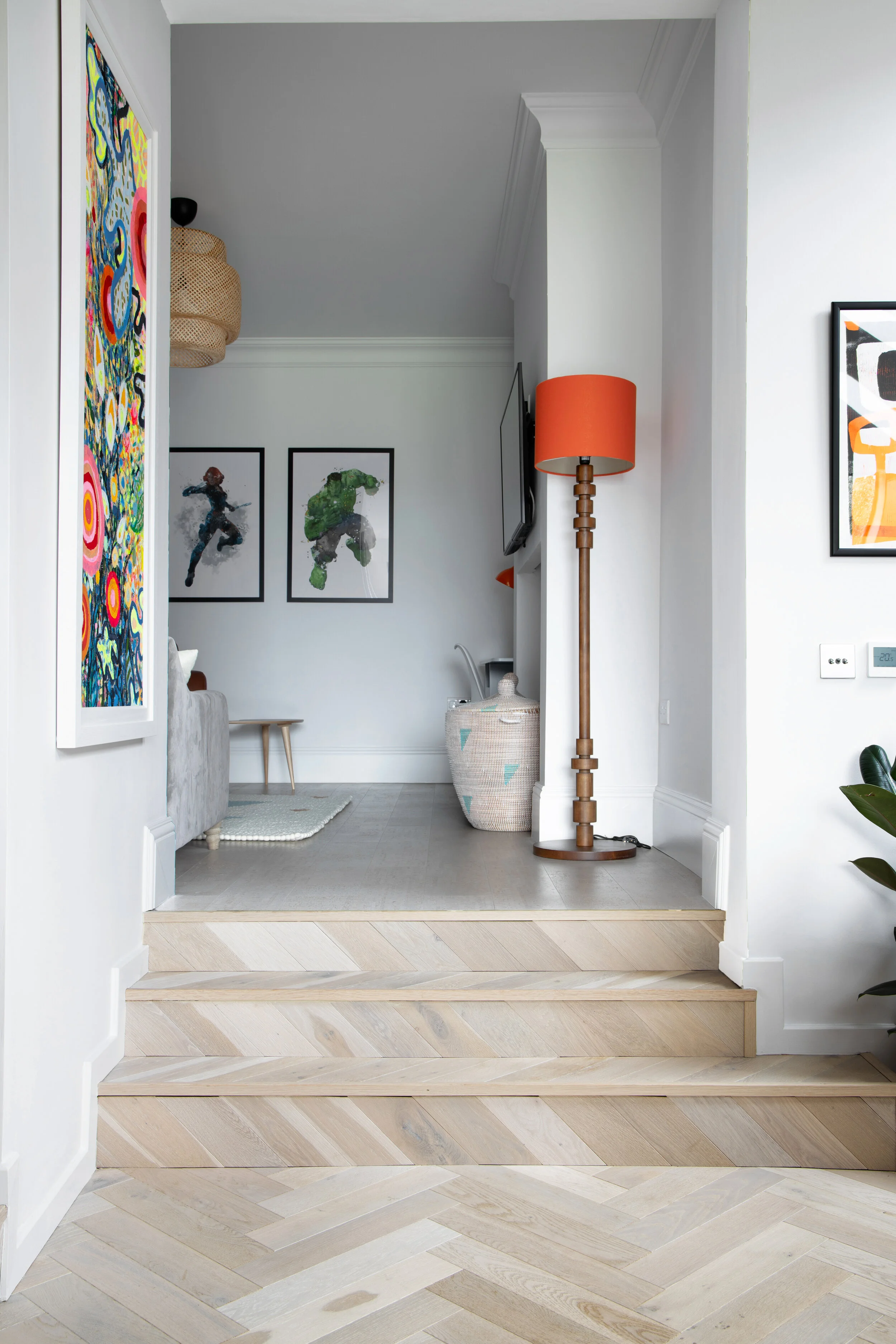
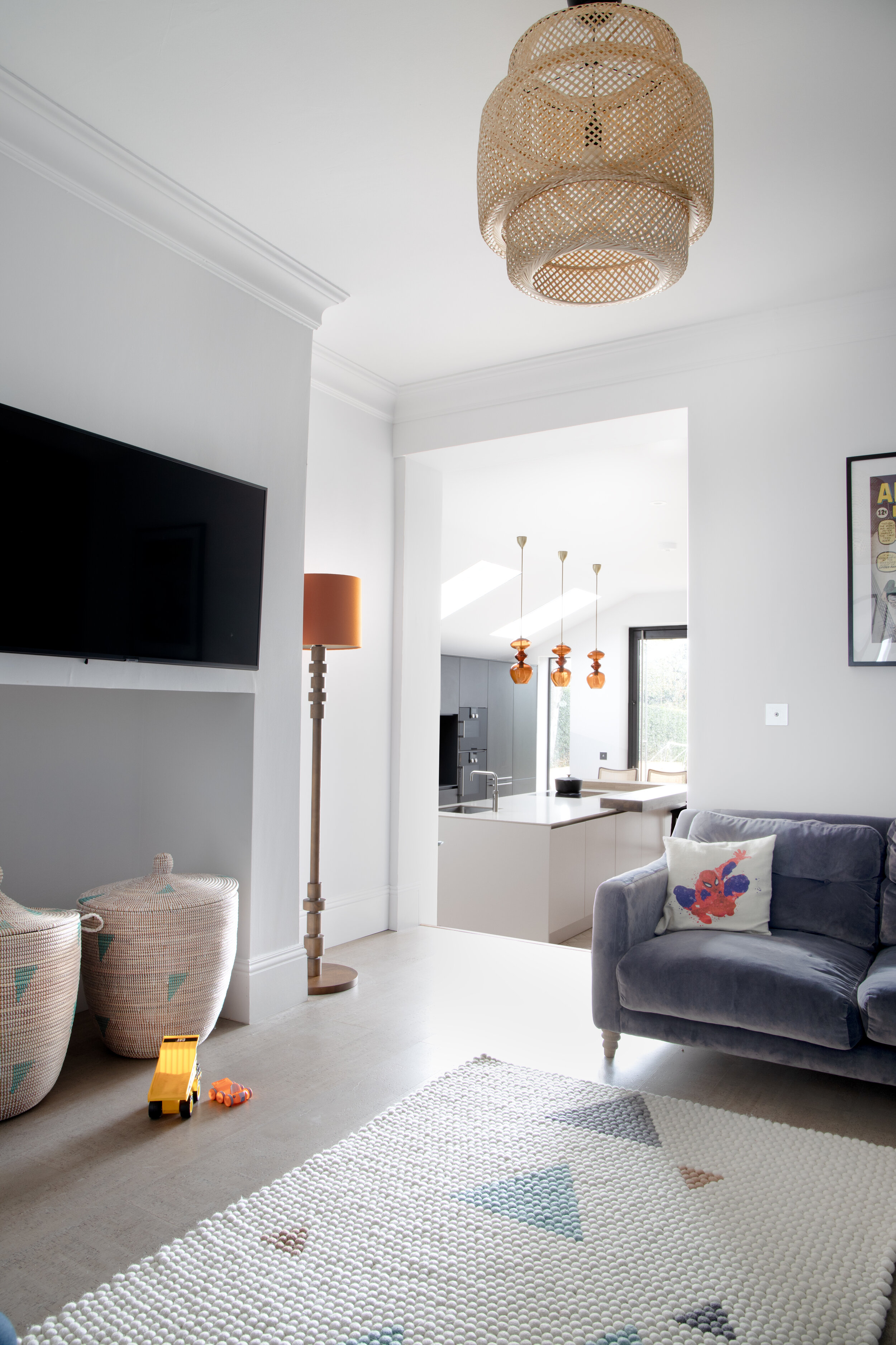
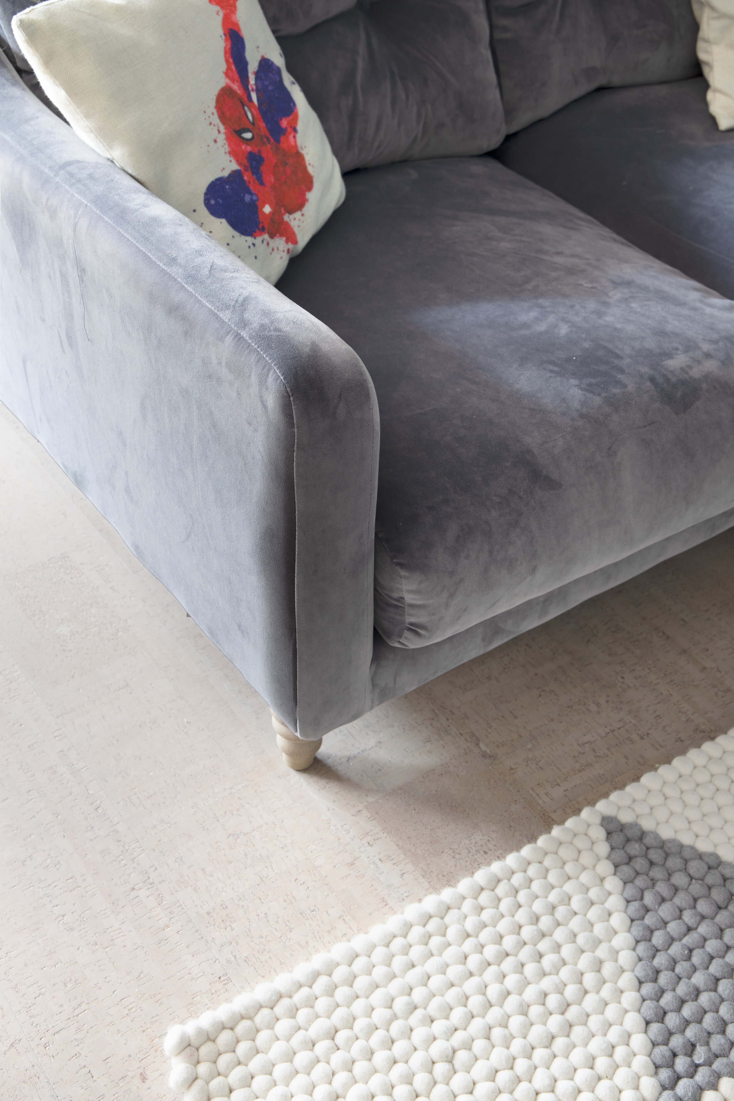
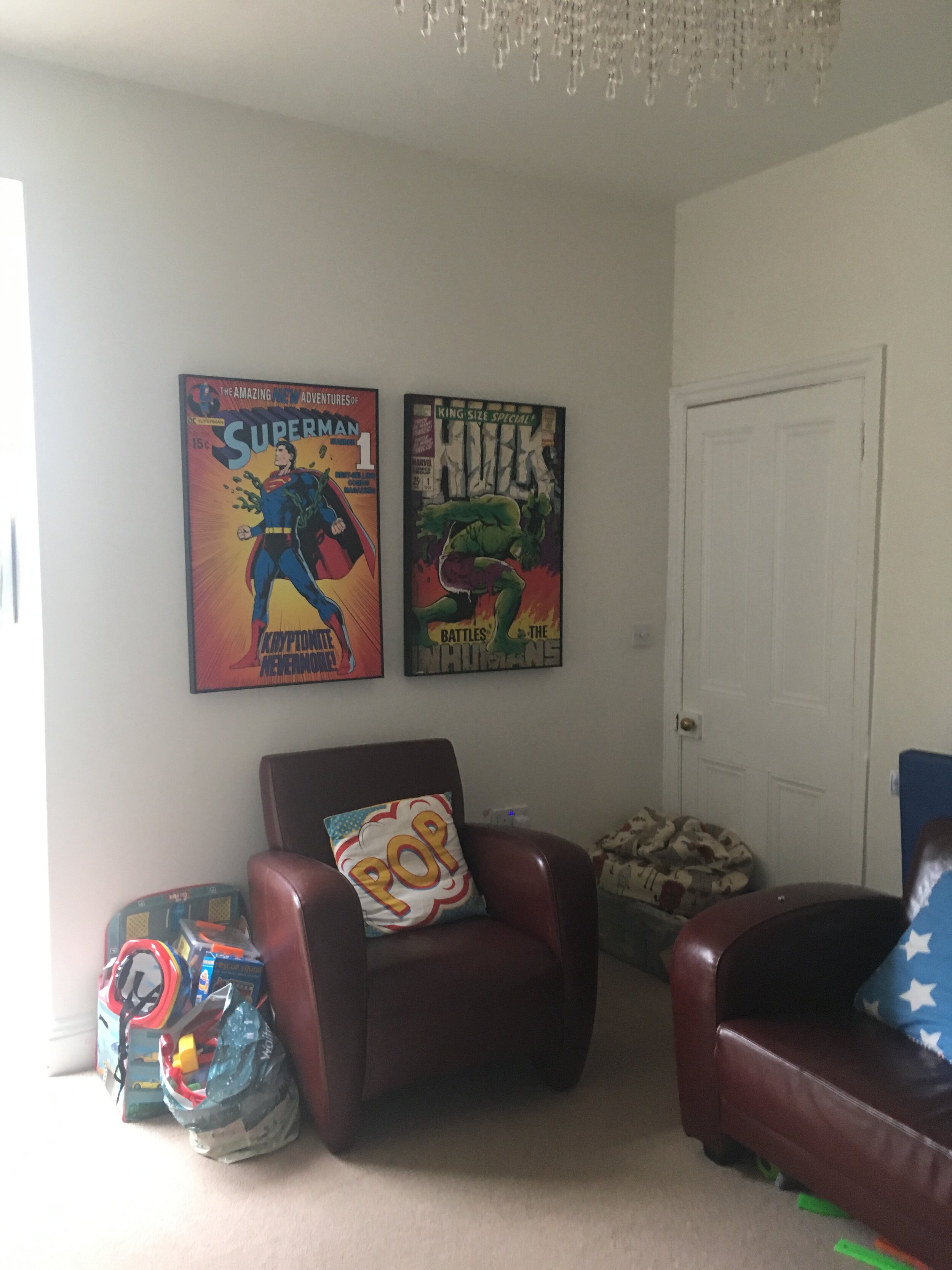
We designed some floor to ceiling built in storage for the boys playroom and painted them Dulux stonewash blue in full gloss with leather handles from Dowsing & Reynolds. The flooring we choose to withstand 3 lively boys was the Bacana Grey Classic Cork from The Colour Flooring Company which is a hard wearing material but is relatively soft underfoot compared to wood and is waterproof so perfect for those accidental drink spills! The kids were big Marvel comic fans too so we wanted to have a nod to this without becoming too themed.

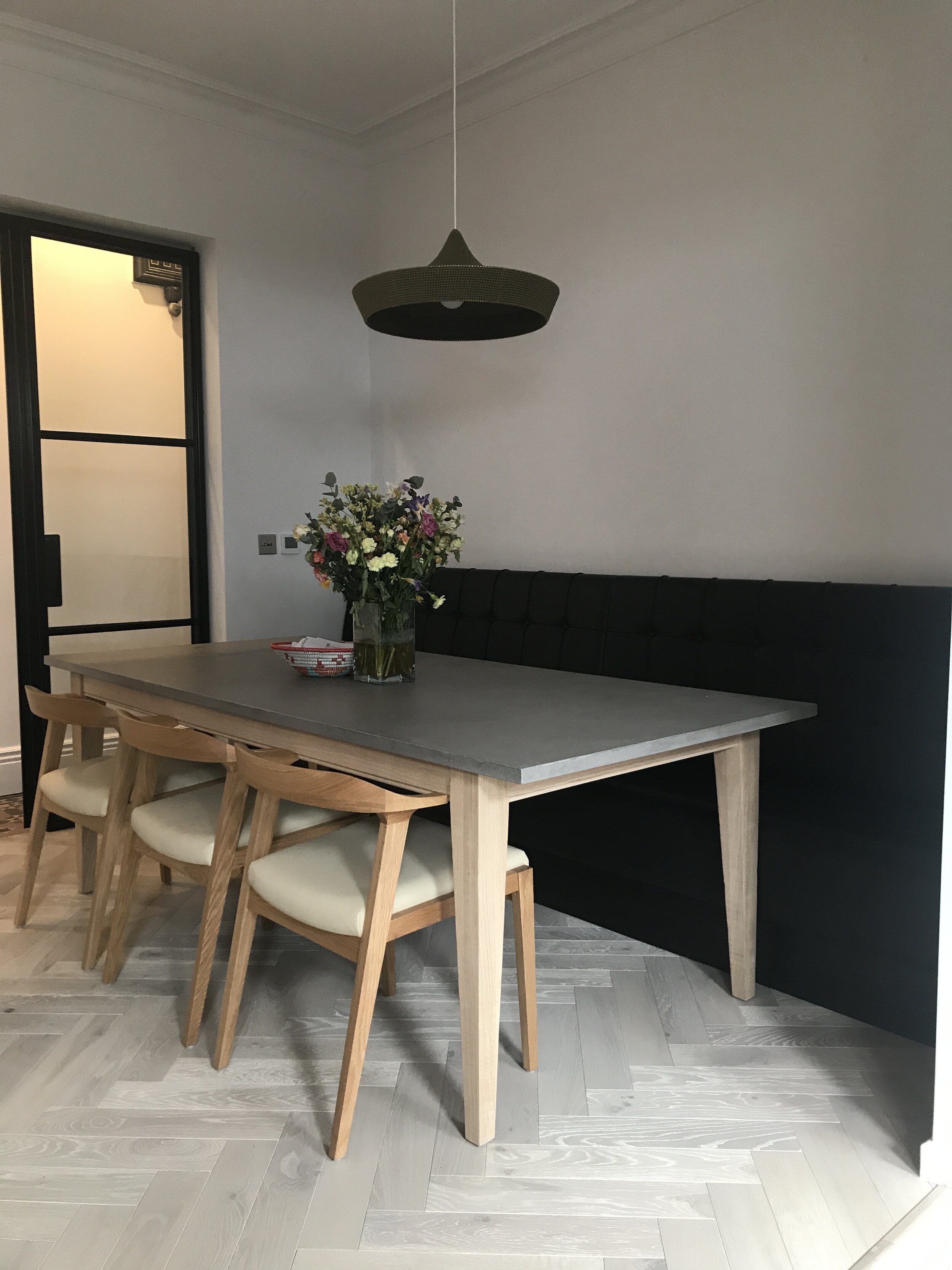
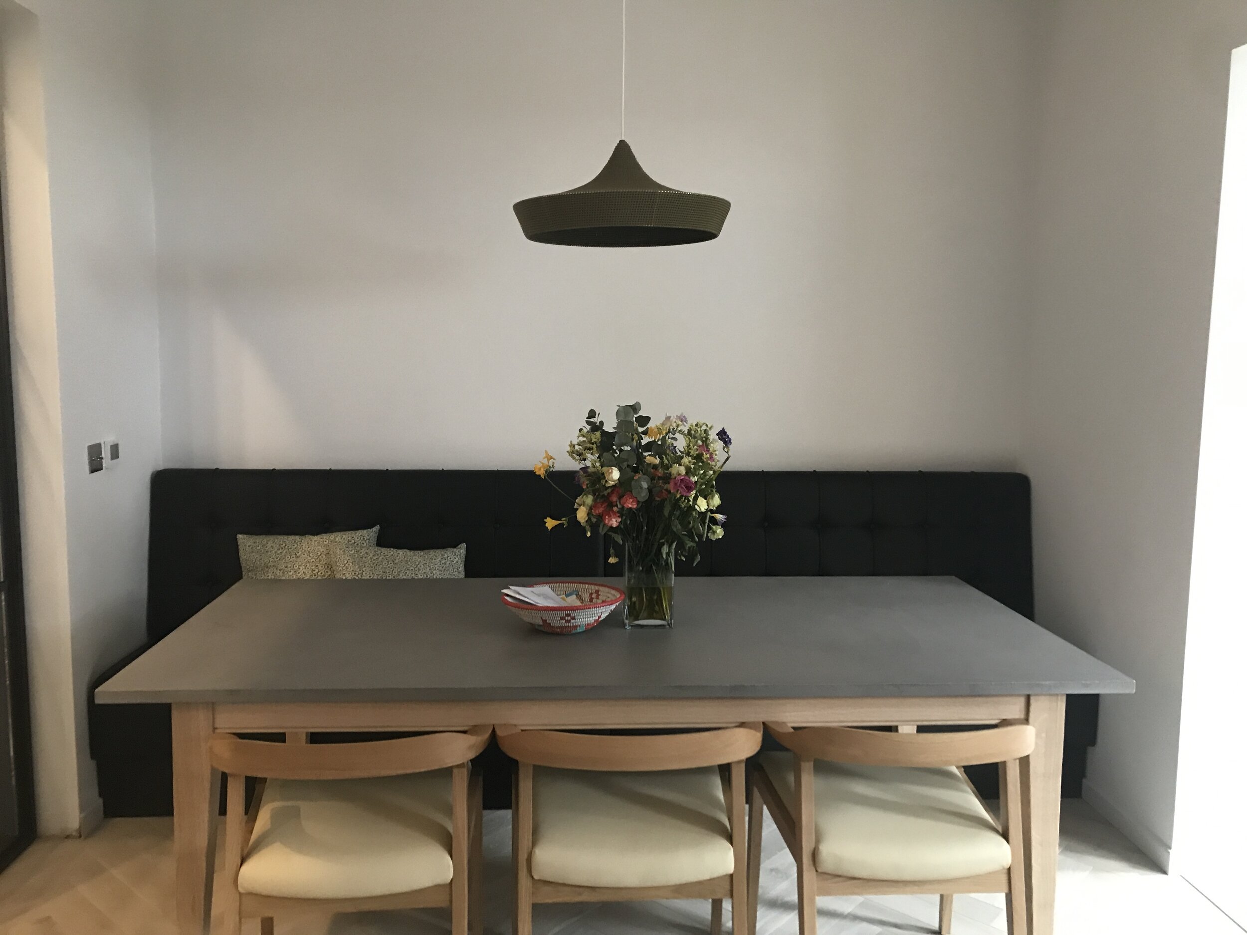
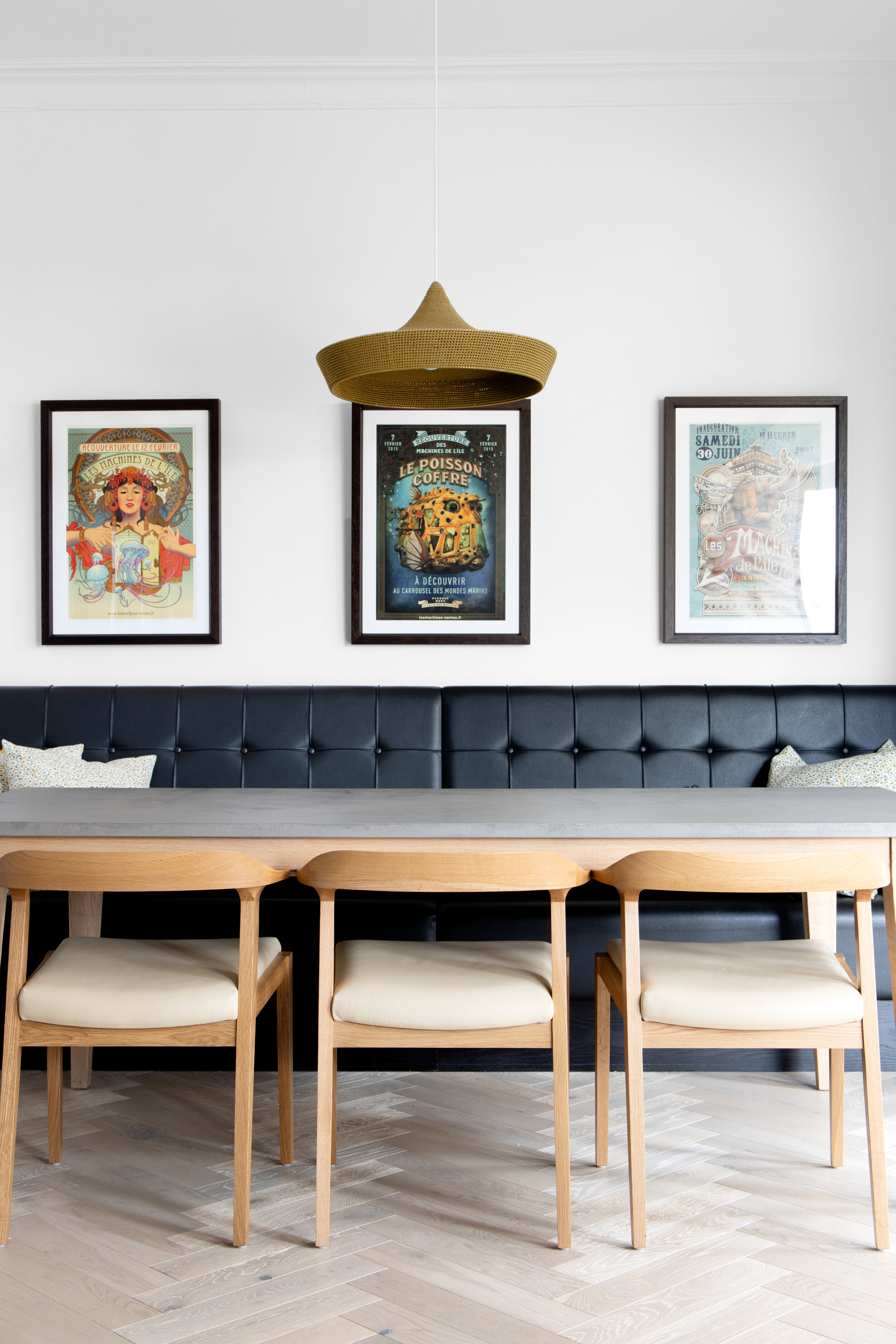
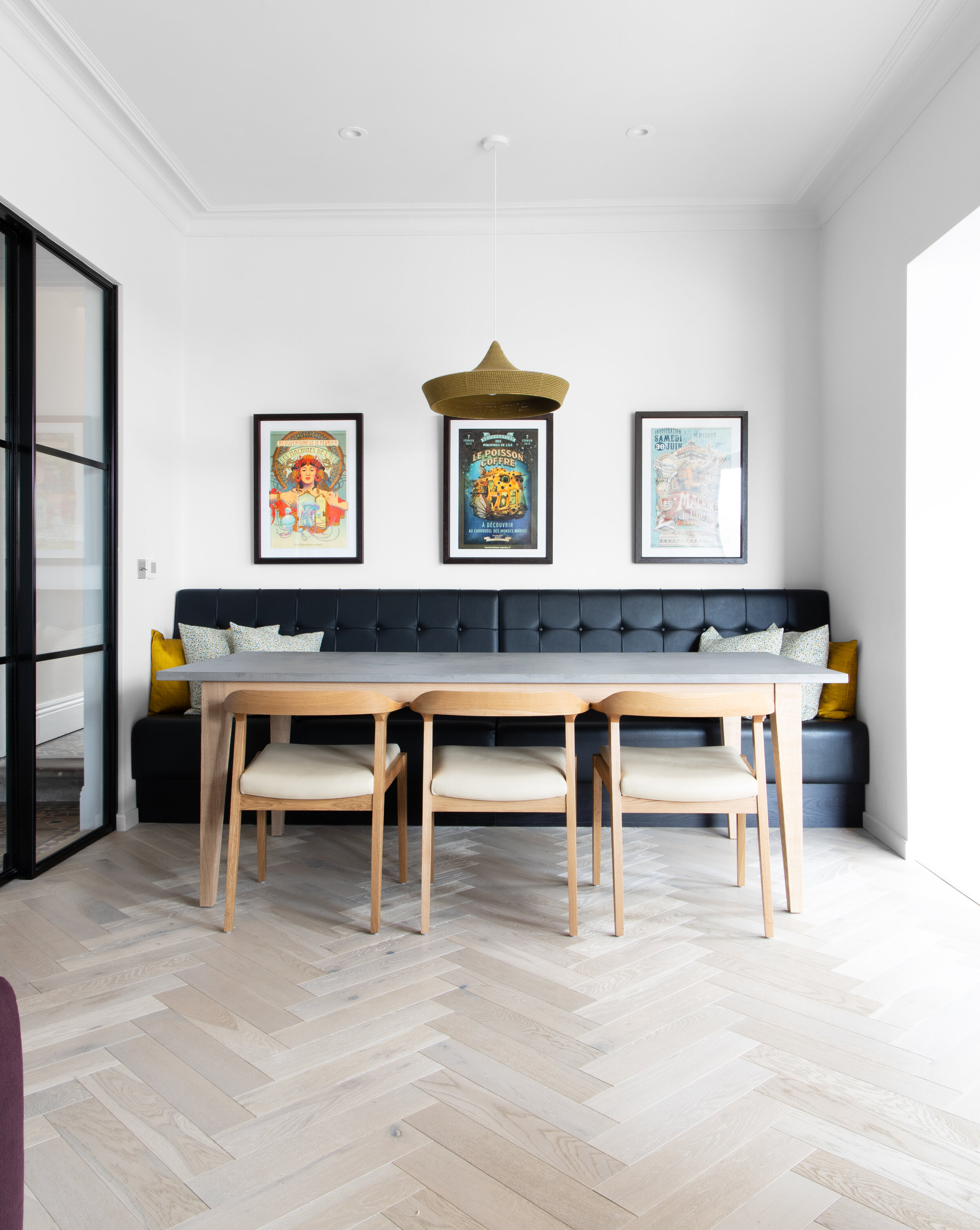
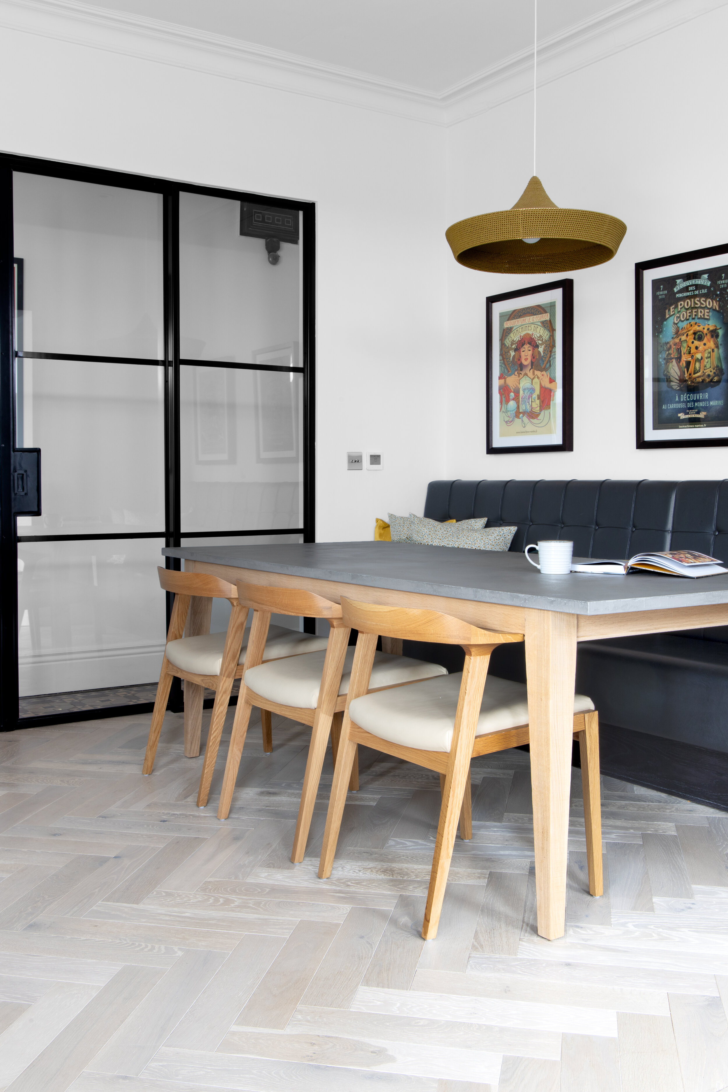
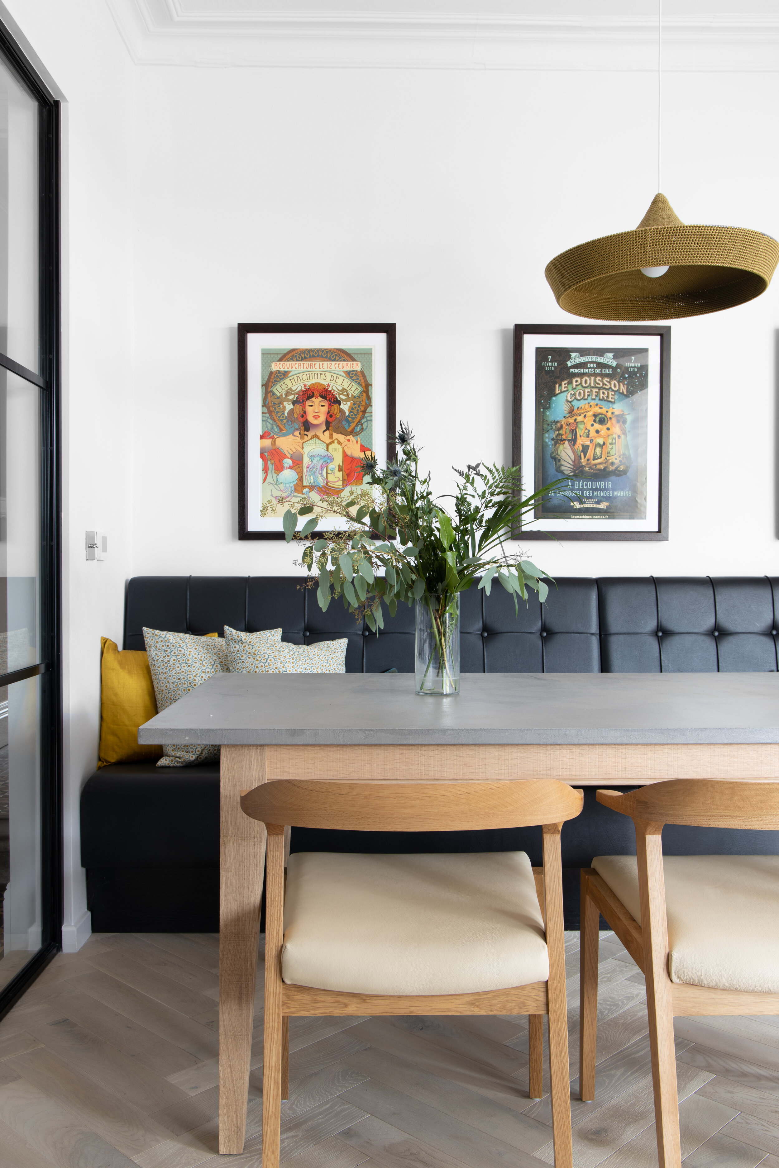
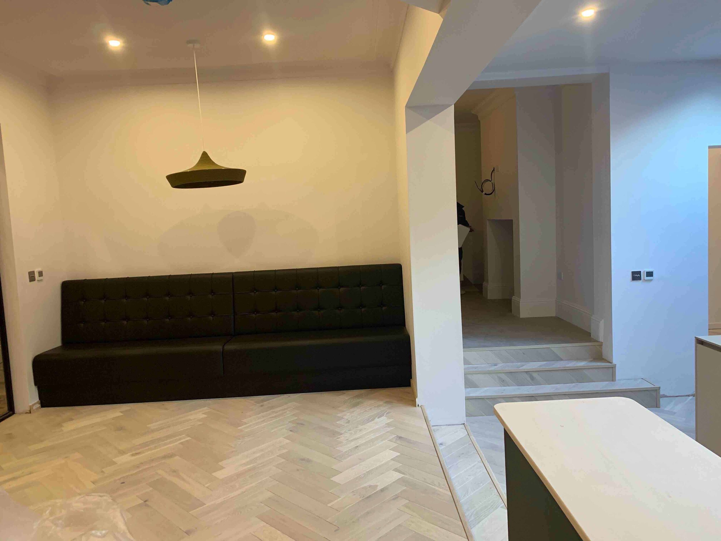
The handmade woven pendant light from Naomi Paul above the dining table is a standout piece in this space and one of the products I was excited to see up and in place. This light was a bespoke piece for the client who were keen to create a unique space.

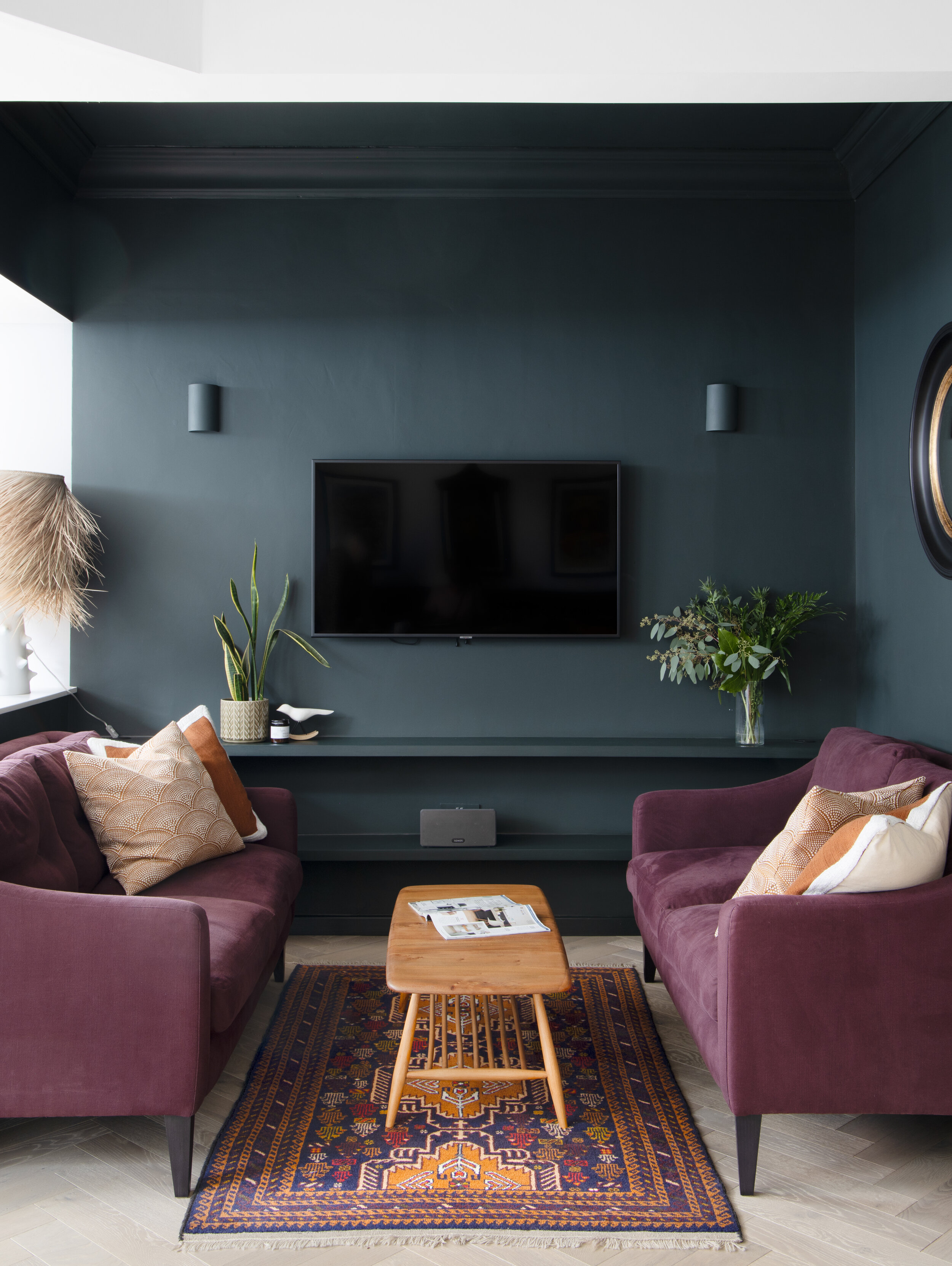
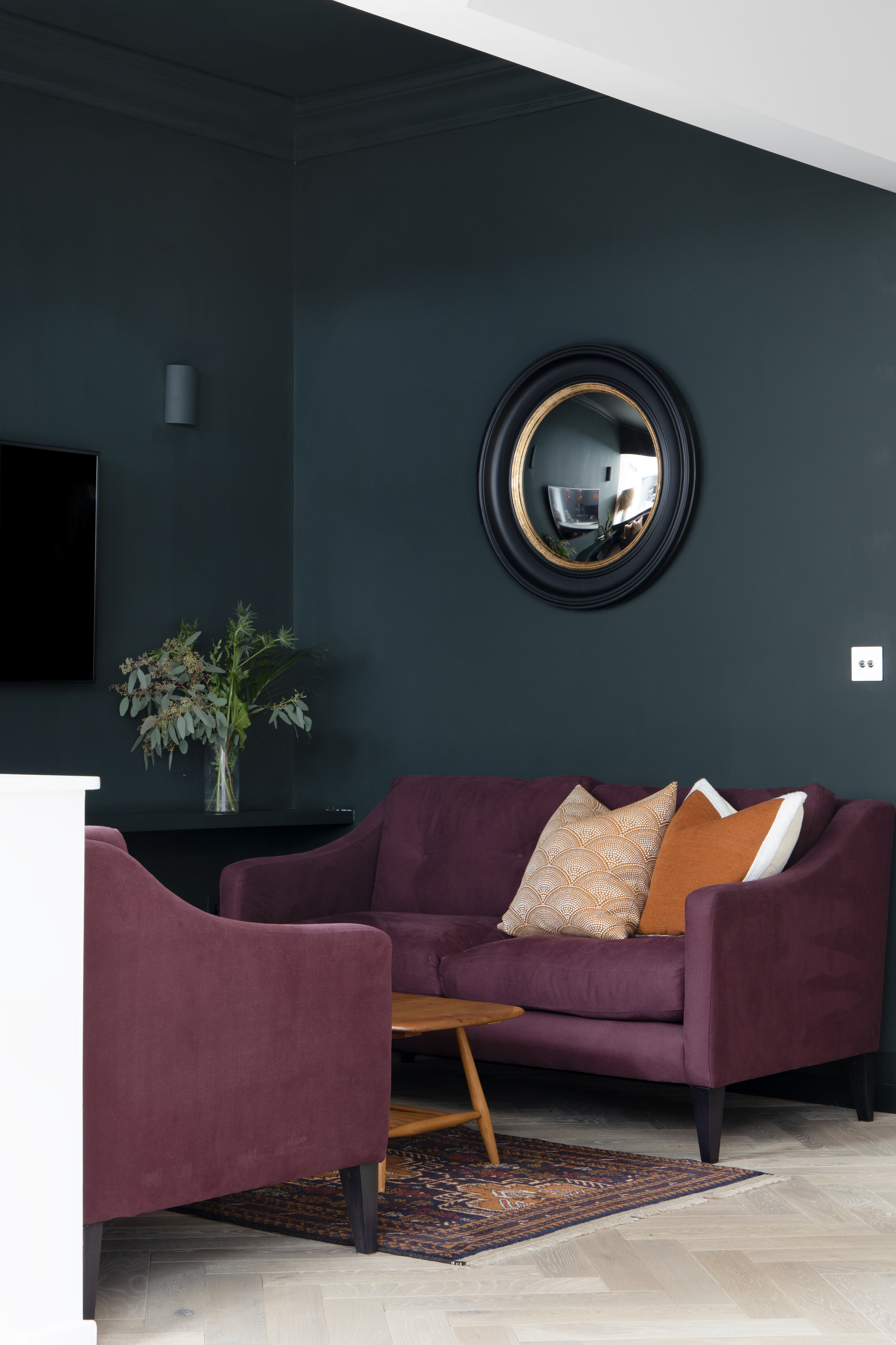
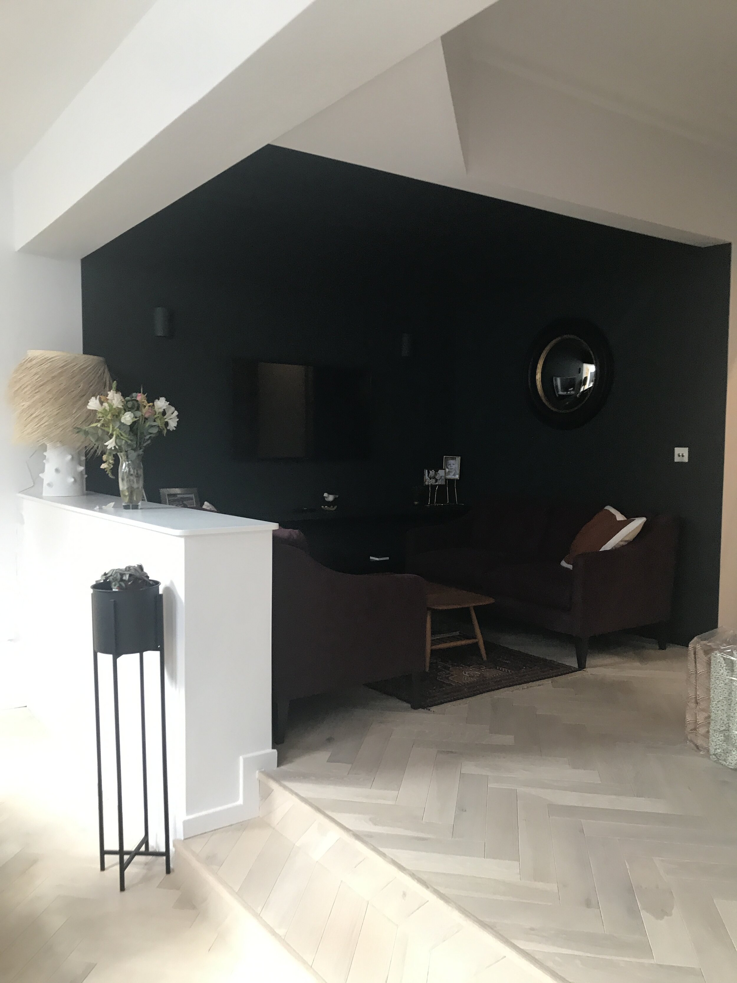
The majority of the walls were painted in Wevet from Farrow and Ball which was also carried into the hallway but to help create a feeling of intimacy in the snug we opted to use a darker studio green on the walls to help distinguish the space from the rest of the open plan area. The darker colour in the snug area also acts as a perfect foil for the rich purple and ochre colours and helps them really shine!

Product

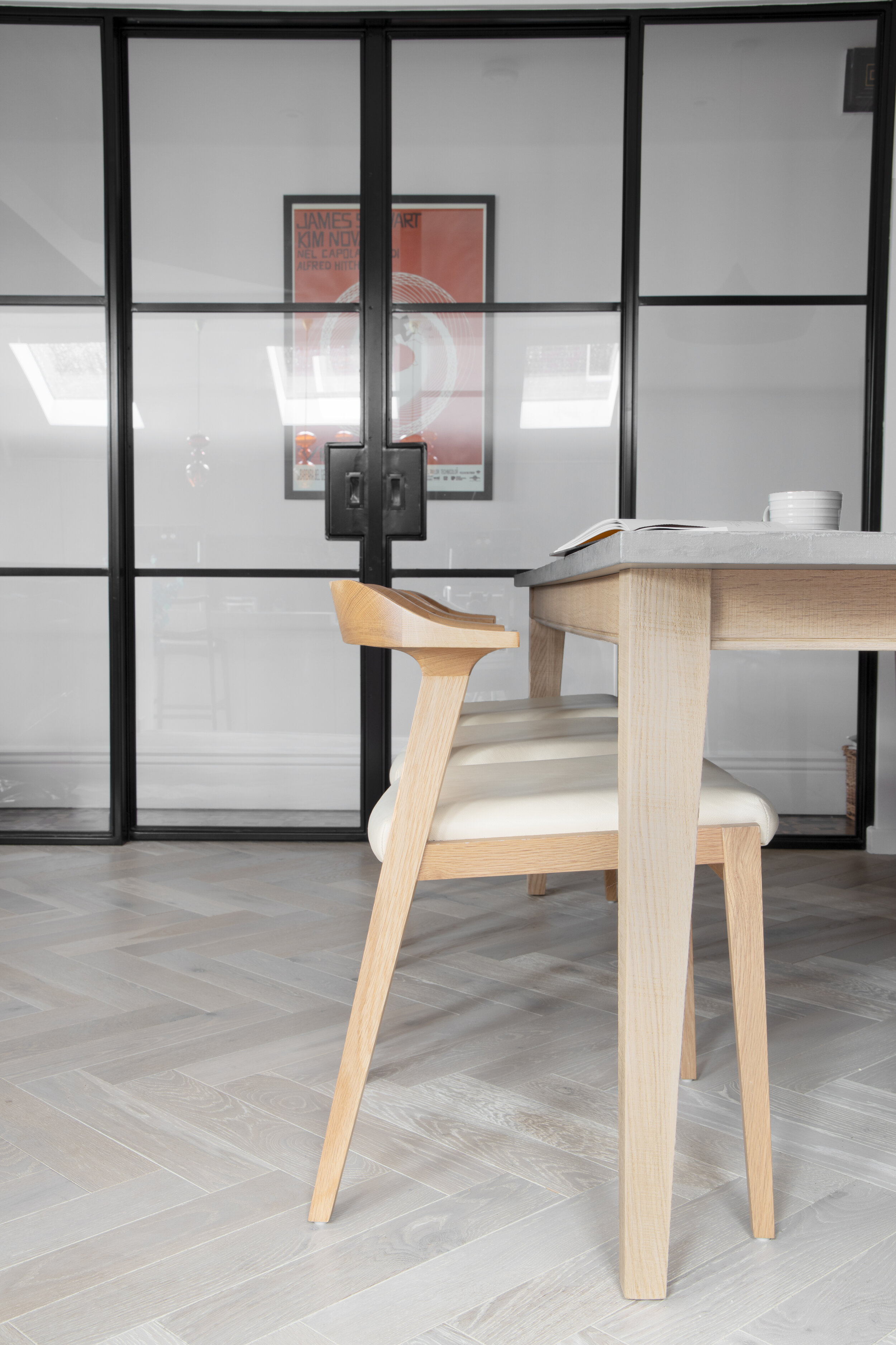
Chairs: Joined and Jointed

Sofa: Arlo and Jacob was the Ferdinand

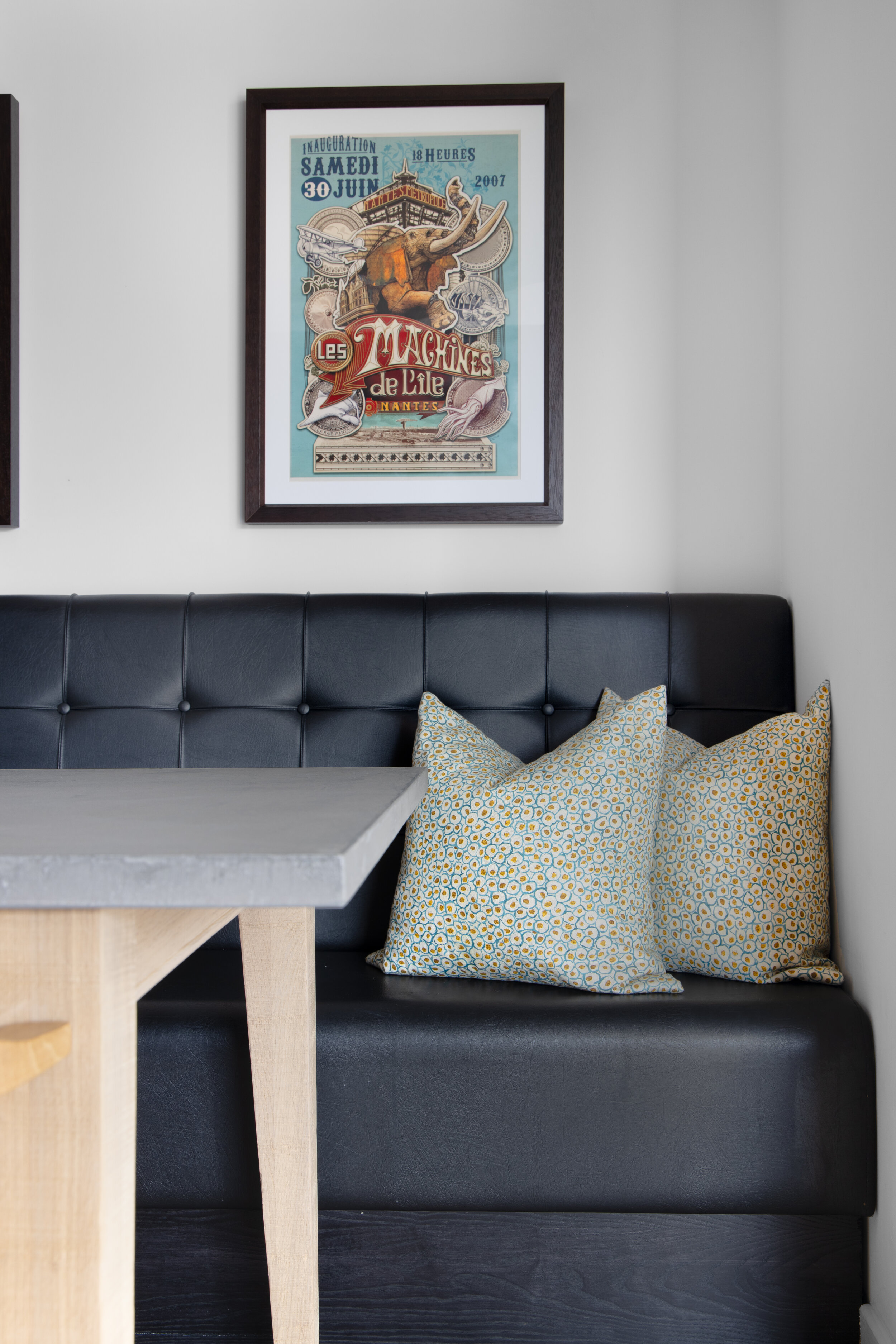
Table: Conker from Loaf

Flooring: Coast from Ted Todd

Lights over Kitchen Island: Futura Pendant from Holloways of Ludlow

Coffee table and rug are both vintage

Tuve, Hong Kong

For me the hotel I stay in whilst on holiday is as important as the location. I like to stay in hotels that inspire me and where good design is a considered part of the whole experience and not an afterthought.

On a recent trip to Hong Kong I was lucky enough to stay at the hotel Tuve on Hong Kong Island. From the street the hotel is very unassuming and its only the weathered steel frontal that alerts you to its presence. You step in and are greeted by a perfect example of minimalism and brutalism which may not be to everyones liking but I absolutely loved it.

Reception Area Hotel Tuve, Hong Kong

Reception Area Hotel Tuve, Hong Kong

The bedrooms have concrete walls and floors and the cracks were filled in with a gold filler which helped highlight and treat the cracks as a thing of beauty and not an imperfection. The schemes in the bedroom feature materials such as concrete, marble wood, steel and glass, but the space never feels too austere or cold.

The hotel is inspired by the Scandinavian photographer Kim Hølterman’s images of Lake Tuve in Sweden and the hotels owner wanted this to be the inspiration behind the interior scheme.

Interior Designer Cheshire

The hotel is definitely a stand out an exceptional space for all the right reasons and its really interesting and exciting to see designers using concrete as a finished material rather than something that needs to be covered.

Christmas Gift Guide - For Her

I’m sure we all have that person in our life that is difficult to buy for? To help I have provided our handy guide so you can treat those people in your life without fear of getting it wrong.

Gift Guide For Her

Beatrice Larkin Cut Throw
Sale Price: £169.00 Original Price: £259.00
Extra Large Handmade Scandi Vase by Tone Von Krogh
Sale Price: £105.00 Original Price: £150.00
Beatrice Larkin Cut Light Cushion
Sale Price: £55.25 Original Price: £85.00
Beatrice Larkin Type Cushion
Sale Price: £55.25 Original Price: £85.00
Botanical Facial Steam
Sale Price: £13.50 Original Price: £18.00
The Superfoods Bar
Sale Price: £8.00 Original Price: £10.50

How to use colour in your own home

So many people want to use colour in their homes but don’t know where to start and are worried that they will make mistakes. To answer the most commonly asked questions received from clients, I have teamed up with colour expert Andrea Curtis in the hope of demystifying the process and giving you the confidence to go ahead and create your own scheme.

What one colour have you used successfully in your own/clients’ schemes? 

​I always like to take inspiration from nature when it comes to colour schemes and I'm a big fan of lots of shades of white, greens and blues used in a variety of tones. blue green tones (not primary blue which I can find too harsh) are incredibly calming colours and they have an affect of calming the body and nervous system and green is the most restful colour on the eye which all help create spaces that have a tranquil feel to them and who doesn't want a calm and collected feel in their home?

Bedroom Scheme in Inchyra Blue from Farrow & Ball, a soft green/blue

Bedroom Scheme in Inchyra Blue from Farrow & Ball, a soft green/blue


I’d love to use more colour in my home, but don’t know where to start… any top tips? ​

The most important tip I believe is to choose colours that appeal to you and not whats fashionable. Pick a core set of 5 colours that you can use throughout the home, I think anymore than this can look a bit too much and the house won't feel cohesive. If you are a bit colour phobic then stick to accessories, a colourful cushion or throw in a space can change the feel of a room, rather than going all out and painting all your walls bright pink!


Where do you start when planning a new room scheme? Is it always with a colour, or is that your finishing flourish? 

​I start with inspirational images to get the feel of the house/room and from there pick out a couple of colours. I tend to use lots of tonal colours rather than pure primary colours in my schemes. Colour is really important and has more of an affect on us than we realise so its an important part of the design process.

Do you think our homes should have a ‘home brand’ colour? Is this a good route to go down if decorating from scratch?

 ​I do believe that you should have a core set of colours that run throughout the home, say 5/6 so the scheme that runs through the house flows and each room doesn't feel like an episode of changing rooms. 

What are the benefits of having a common colour that runs throughout a home? Does it make it easier to decorate and accessorise? 

​It helps you stay focused with what you actually need to purchase for a room and not get side tracked into buying something that is shiny and exciting/in the sale and then doesn't fit anywhere within your scheme so it can help you ultimately save money and time buying things you don't need 

Living room design in Farrow & Ball Downpipe

Living room design in Farrow & Ball Downpipe


Can you go overboard with one colour?

Any tips on getting the proportions right? Should it be a touch rather than a whole room in that colour? ​Absolutely. there is a general rule in design of 60-30-10. So 60% of the room should be a dominant colour, 30% should be a secondary colour or a texture and the final 10% should be colour brought in through accessories. However this isn't a heard and fast rule but its a good basis in which to start a scheme. As an example you could use a shade of white as your dominant colour, a colour and texture such as blue velvet for your main pieces of furniture such as a statement sofa and then green as an accent colour in the cushions.


A calm bedroom scheme in tones of grey, wall colour Farrow & Ball Cornforth White

A calm bedroom scheme in tones of grey, wall colour Farrow & Ball Cornforth White

Should you go for the same shade or vary it? How can you make shades of one colour work? 

​If you go for one colour I definitely think you have to vary the shade, it helps provide depth to a space and scheme and also interest for the eye. If everything was one tone your eye wouldn't be able to distinguish between all the different elements and it would feel flat and uninteresting to look at. A room in one colour but with lots of layered tonal accessories is such an interesting way to create a scheme.

Should you be wary of choosing an on-trend colour, such as Pantone’s blue?

Soft colour scheme for a little girls room, wall colour Farrow & Ball’s Strong White & Calamine

Soft colour scheme for a little girls room, wall colour Farrow & Ball’s Strong White & Calamine

 ​If you have always liked the specific Pantone colour that has been chosen for that year then yes go for it but I would never recommend someone go with an on -trend colour just because its 'fashionable' now. The very nature of trends means that they are designed to go out of style. If you choose colours that appeal to you then you can't go wrong and your home will hopefully never look dated.


Why do some accent colours endure, such as blush pink, ochre yellow? 

​Pink is a joyful colour and blush pink specifically is really soft and could also be considered a neutral and works well with so many other colours, this could be a reason why it has endured so well. Ochre lies somewhere between yellow and orange on the colour wheel and in colour theory is a warm, inviting and sociable colour whilst yellow is again a uplifting and the colour of optimism so I believe these positive connotations mean it has long lasting appeal

.

The first room I decorated was in a colour that I haven’t since used elsewhere and now it feels odd… where did I go wrong? 

​When decorating a whole house you have to think about the house as a whole and not on a room by room basis. You need to consider how colour flows from room to room and what the 'sight lines' are from  one room into the next as each colour can affect how the other reads. Its best to buy samples, paint A4 cards with the chosen colours and see how the colours all work together and if they are harmonious. You will also then need to check each colour in the space its intended as the light can also affect the colour, this is the simplest way of not making a mistake when choosing a scheme for your home. 


If you need any help with your own colour scheme then do get in touch wither either myself of Andrea to see how we can help


Further Reading:

Living Rooms FAQ

Polished Concrete Floors; pro’s and con’s