Let it be beautiful, let it be yours

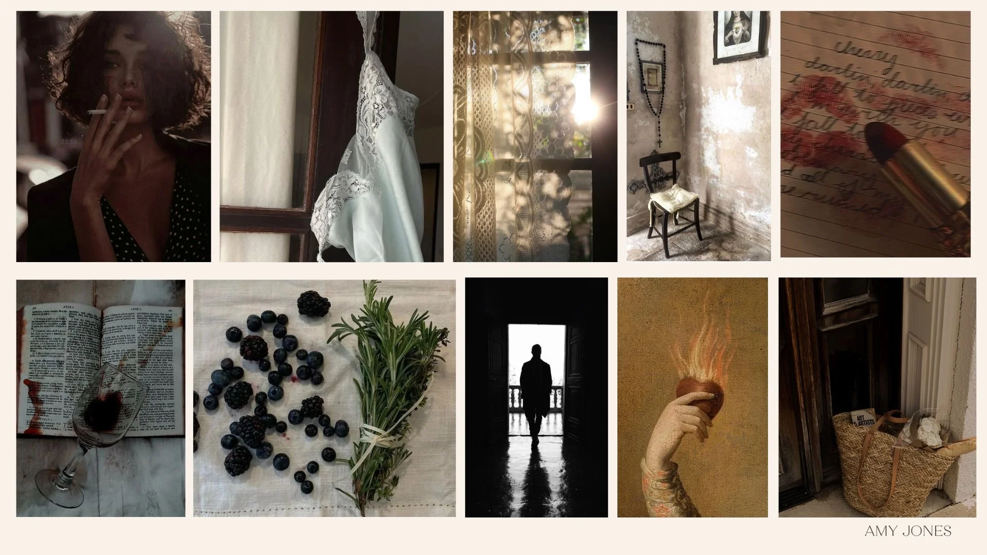
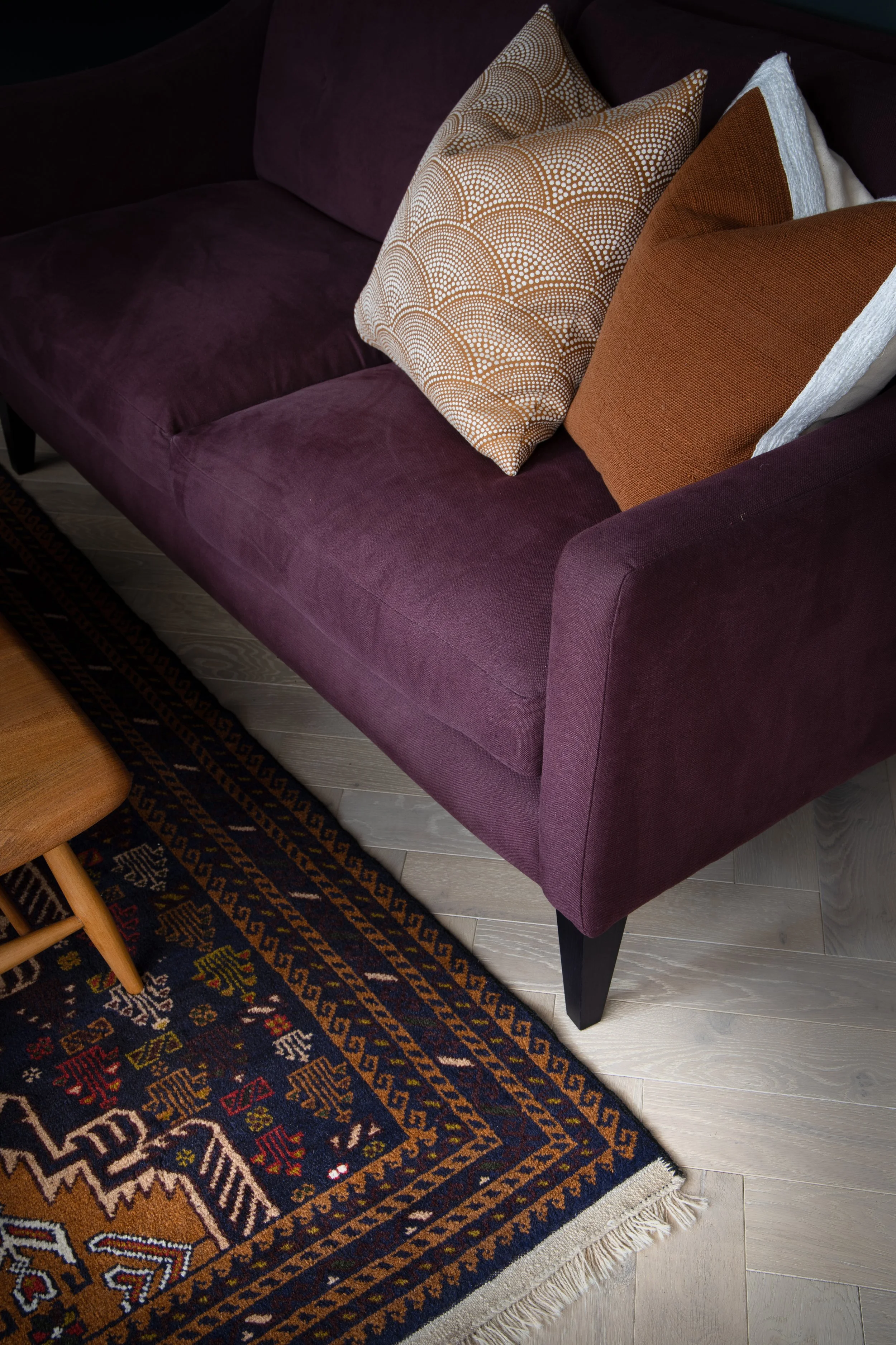
Some spaces don’t need drama, they need depth. A bath carved from stone, candles that have burned all the way down, linen that doesn’t need straightening. Rooms where silence is welcome, not awkward, not cold, just honest.

This concept came not from inspiration boards, but from embodiment.

From the version of me who no longer chases softness, she lives in it.
The woman who once held everything together, now lets herself be held.
The one who, as I wrote in TOO MUCH, finally realised:
“I don’t need to be rescued. I just need to be met.”

Design for nervous systems, not just sightlines

This is what I bring to every project: The understanding that space is emotional, that quiet is sacred., that beauty can be powerful without being loud.

Because the truth is, most of my clients aren’t just designing a room, they’re designing a return.

To themselves, to their values, to a life that feels like theirs, not someone else’s idea of success.

I wrote: “I don’t cry on the way to someone else’s dream anymore. I build my own.”
And that’s exactly what this work is, building spaces that reflect your dream, not what Pinterest says you should want.

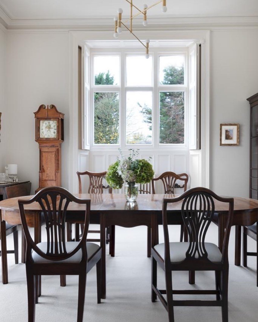
For brands and projects that mean something

This kind of visual world speaks to people who don’t need convincing.

You're a boutique hotelier, a brand building a legacy, a couple investing in a second home because you’re done waiting.

You don’t want flash, you want feeling. You don’t want a photoshoot, you want a concept with soul.
You don’t want seasonal trends, you want timeless texture and emotional resonance.

The spaces I design, and the brands I creatively direct, don’t exist to impress.
They exist to remember.
As I wrote: “This isn’t a comeback. It’s a reintroduction.”

Let’s work together

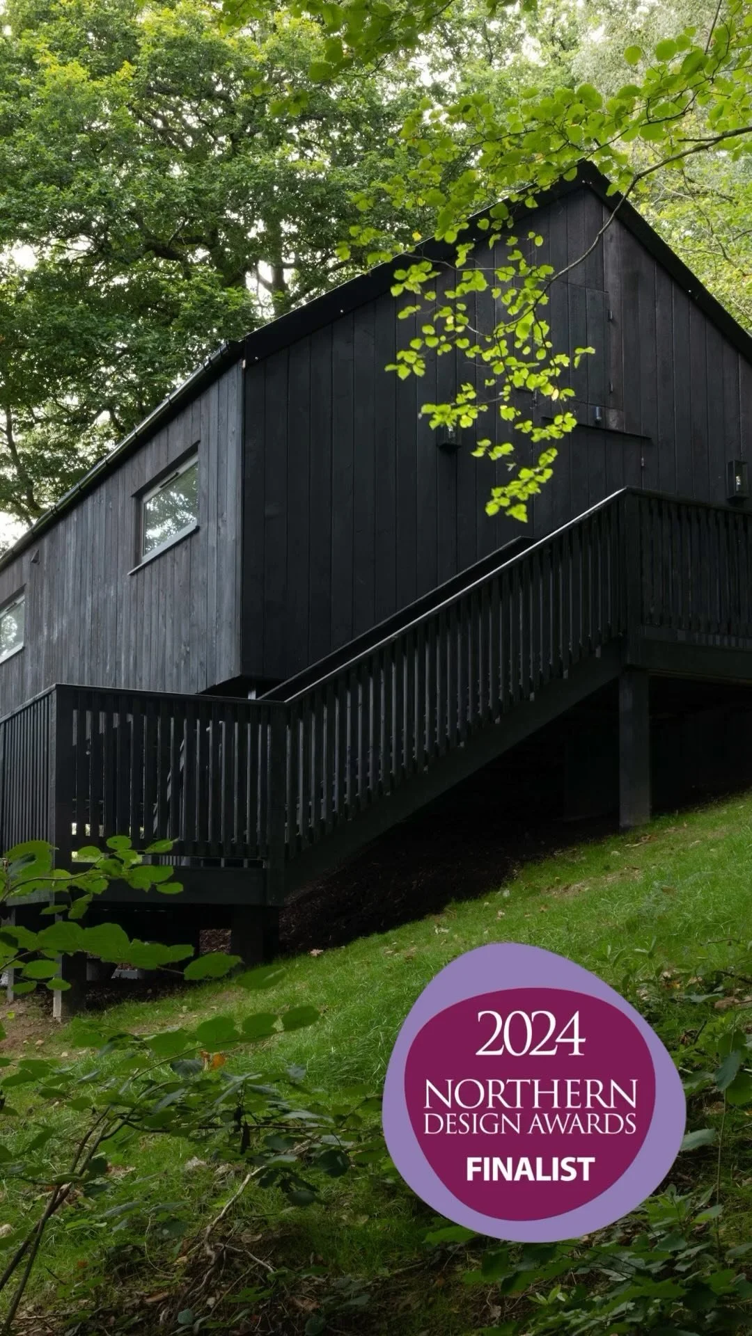
If you’re building a retreat, restoring a home abroad, launching a lifestyle brand, or you just know this feeling belongs to you, I’m ready.

📩 Enquire for:
– Heritage homes and second properties (UK & Europe)
– Boutique hotel design and concept development
– Brand styling with emotional clarity and creative direction

📍Based in the UK, available internationally

Because this is more than design.
This is the visual language of a woman who came home to herself.

And now helps others do the same.

Learn morec

It’s Not Just a Mood Board. It’s a Story You Can Feel.

This one came together without noise or overthinking. Not for a client., not for Pinterest, It came because it needed to.

There’s a certain kind of project that doesn’t shout. It pulls you in quietly, you don’t always know why it works, you just feel it. That’s what this board holds.

A doorway that’s seen a hundred years, seaweed drying in the wind, a window that’s fogged up from the inside, a woman, not performing, just existing

It’s not about making something look nice. It’s about what it stirs in you.

What I do isn’t just design, it’s direction

I work with feeling, always have and the right brands feel that. The ones who want more than a slick campaign or a one-off shoot, the ones who care about tone, pace, texture, the ones building something lasting.

If you’re a brand or creative team looking for someone to shape the visual language of your next project, whether that’s a collection, a space, or a story, I do that.

I don’t force concepts. I listen for them. Then I translate that feeling into something people can see, touch, remember.

Why It works

Because it’s honest, because it doesn’t rely on trends, because it trusts the viewer to feel, not just look.

This mood board is one example of that. It’s not filler. It’s a full, emotional brief in pictures.

If it resonates, you’re probably one of mine.

Let’s Talk

I work with brands and businesses who want creative direction that’s layered, soulful, and clear. Whether you’re building a product, a place, or a campaign, I’ll help you tell the story through feeling, not just surface.

📩 Drop me a message to talk about art direction, styling, or brand shoots.
📍Based in the UK, available for work across Europe and beyond.

Contact me

Sunlight, sin, and soft Linen: Designing with soul in warmer climates

Some spaces ask to be softened, others ask to be set on fire, this concept does both.

This board holds the feeling of a southern house, a villa, a hotel, maybe even a former chapel turned retreat. The air is thick, slow, the light pours in like honey and underneath it all, there’s a pulse, feminine, wild, slightly undone.

There’s lace, but also lipstick, fruit and wine, but also the sting of rosemary a handwritten note no one was meant to find.

This is what I design for.
Not surface, but story. Not trends, but temperature.

For brands, investors, and visionaries abroad

Whether it’s a boutique hotel, a second home in Spain, or a shoot that needs more than just a stylist, what I create is immersive, people feel it, even if they can’t put their finger on why.

This isn’t just about beautiful rooms, it’s about the kind of beauty that lingers. The kind that gets under your skin and stays with you long after you’ve left.

If you're a hotelier, a brand looking to expand into deeper visual identity, or a homeowner abroad ready to create something iconic this is your lane.

Why it works

Because it’s real, It’s sensory and it doesn’t rely on formulas.
There’s a reason guests return to certain places again and again, it’s not just the bedsheets or the view. It’s how it feels.

This is where memory gets built, a corner chair against an old wall, the shadow of lace at golden hour, a handwritten letter smeared with red

It’s not staged, it’s lived in, that’s the difference.

Let’s talk

I work across interiors, creative direction, and concept development, especially for brands and properties abroad looking to build something soulful, layered, and emotionally resonant.

Whether you're launching a boutique hotel, designing a second home, or building a campaign that needs story as well as style, I can help shape the vision.

📩 Enquire for collaborations, design, or direction
📍Available for travel across Europe

Beige, but make It bold (And Yes, I use colour too)

Let me explain.

It’s not really about colour, its about identity, about not shrinking into what people expect whether that’s in your home, your personality, or your life.

Because when people hear “beige,” they often think safe, bland, forgettable, like it’s just there to fill a gap and not get in the way.

But that’s never been me and it’s not how I design.

The way I use beige? It’s bold, it’s rich, it’s layered and full of soul. A quiet kind of confidence, not screaming for attention, but still commanding the room.

And yes, I use colour too.

But not just for the sake of it. Every tone is considered, grounded, deep greens, warm ochres, dusky blues they’re chosen for how they feel, not just how they look.

Because colour doesn’t have to be loud to be powerful and neutral doesn’t have to be boring to be beautiful.

You don’t need neon to be noticed, you don’t need noise to be remembered.

So when I say I wasn’t built for beige,” I mean I wasn’t built to blend in. But when it’s done my way,. layered, intentional., soulful, it becomes something else entirely.

That’s the kind of beauty I create, not surface-deep, but grounded, refined and unapologetically yours.

Contact Me